Category News
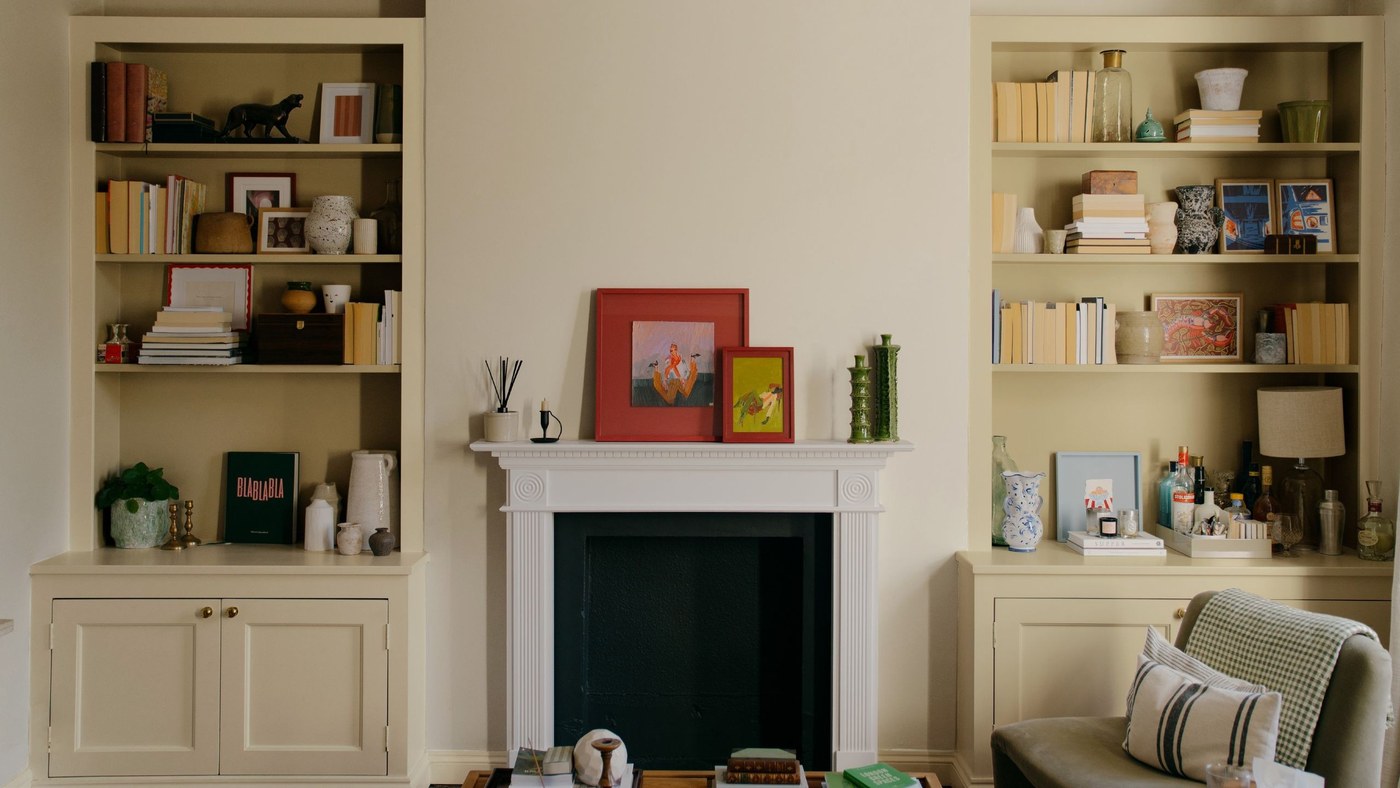
Assess Paint Color in the Light Where It Will Be Used
COAT's expanded range places emphasis on UK interiors.
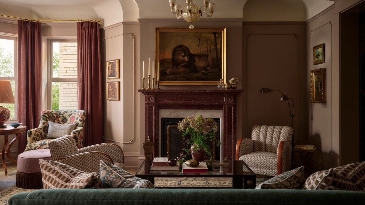
Make a Room Cozier through Contrast, Light, and Arrangement
Seasonal layering can involve furniture and harder materials as well as extra blankets.
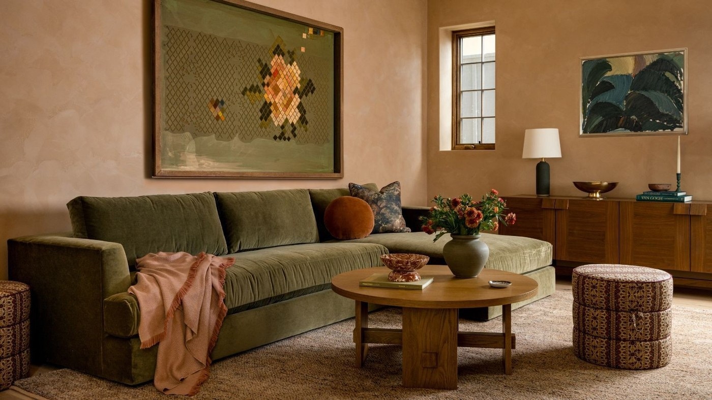
A Living Room Needs a Texture Scheme as Well as Color
Smooth stone, woven rugs, and richer upholstery can connect a restrained room through material contrast.

A Neutral Living Room Needs Material Contrast
Cream upholstery gains depth from wood, marble, and layered textiles.
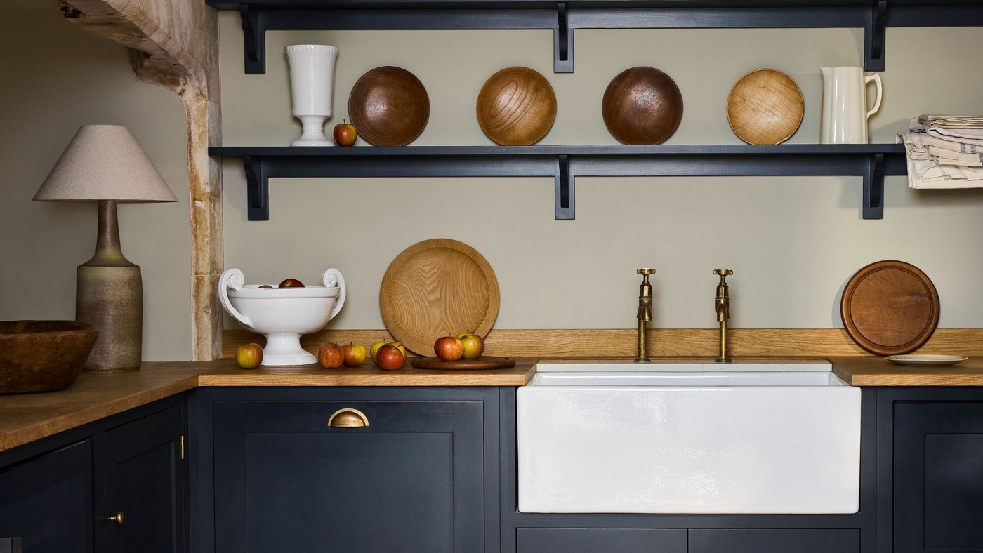
Muted New Paint Shades for a More Layered Interior
Little Greene's expanded range favors depth without uniformly bright saturation.
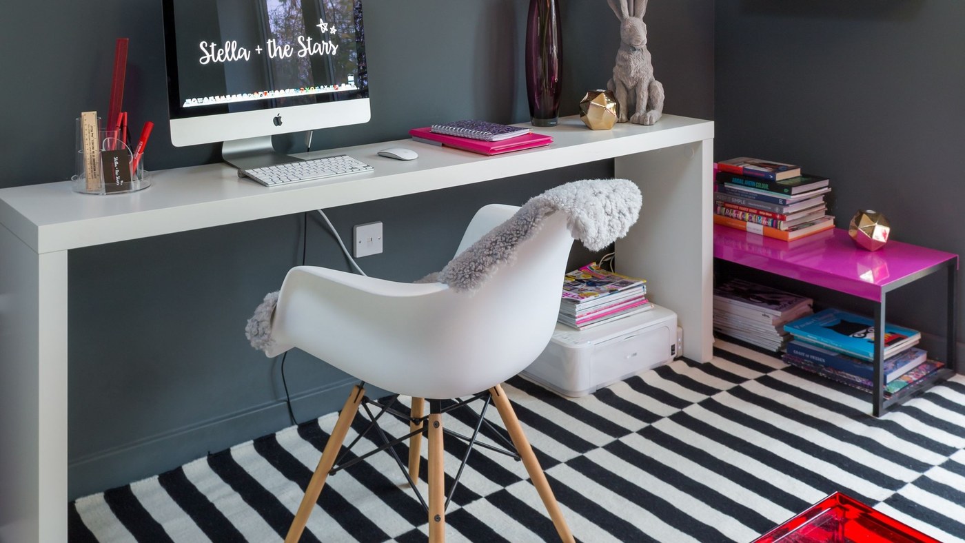
Soften a High-Contrast Interior with Related Tones
Off-white and earthy shades can provide a different balance.

White Curtains Work Best When Their Texture Has a Role
Linen, lace, or gathered panels can provide a neutral pause within a more colorful living room.
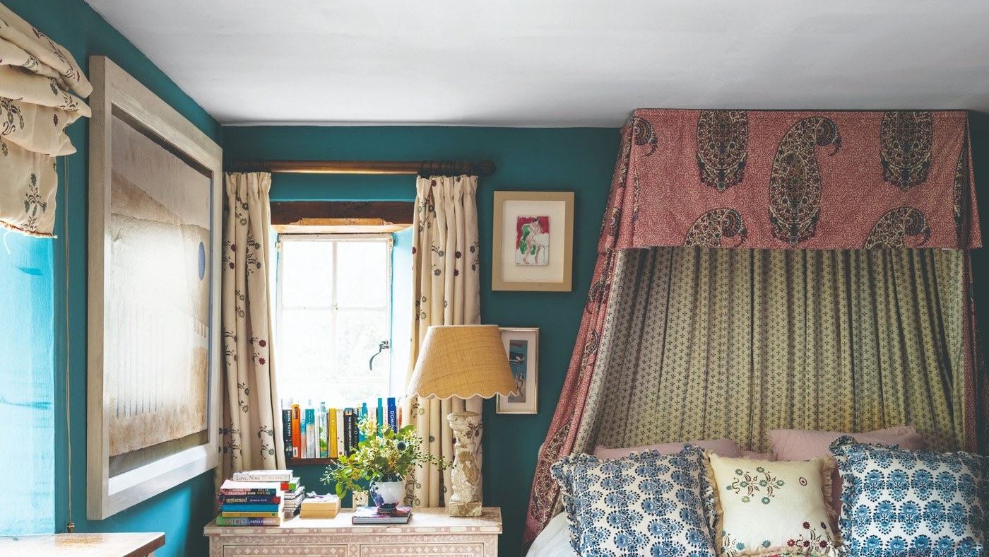
Connect Curtain Color and Trim to the Room's Existing Palette
A coordinated edge detail and suitable fabric can make window dressing feel part of the wider interior.
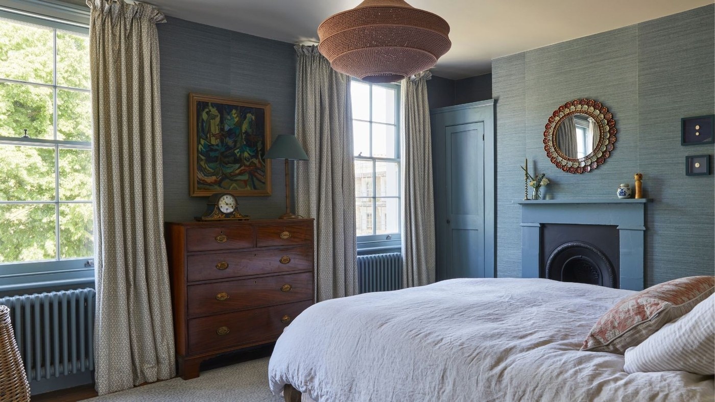
Layer Curtains to Separate Light Control from Decorative Color
Sheers and a second set of panels can provide different functions within one considered window treatment.

Floral Curtains Can Belong in a Balanced Living Room Palette
A pale foundation and considered pattern scale help botanical drapery feel connected to the surrounding furniture.
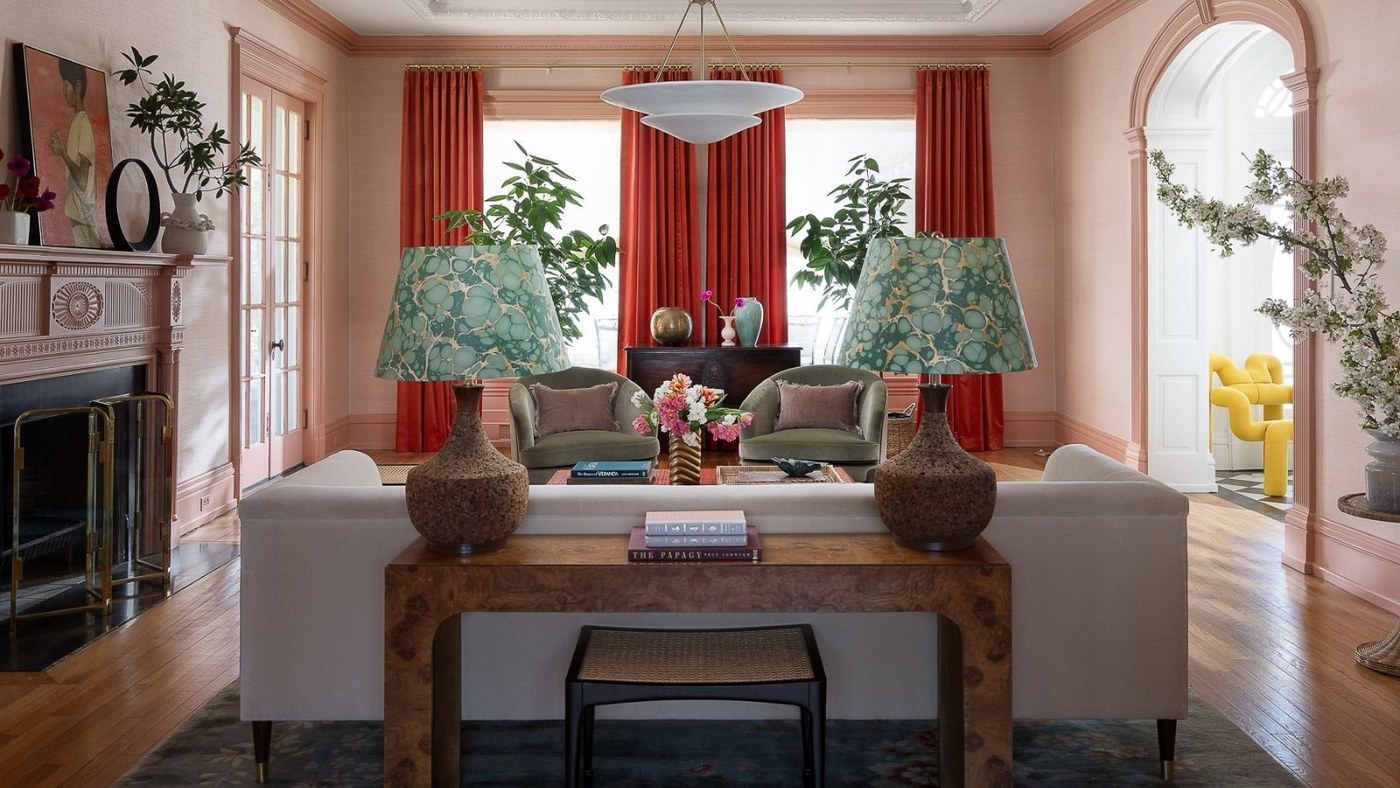
Choose Curtain Color in Relation to the Whole Room
A drapery shade can support or disrupt a palette, so judge undertones alongside walls and furniture.
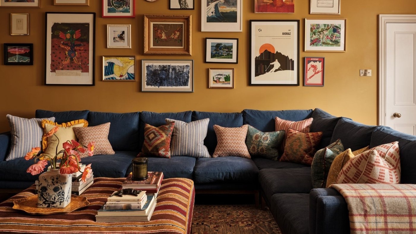
Choose Living Room Color for the Way the Space Is Used
A durable palette connects walls, furniture, and everyday activities rather than relying on a trend alone.

Pink Pillows Bring Focus to a Neutral Living Room
A small area of pink can add warmth and character while leaving the main room palette restrained.
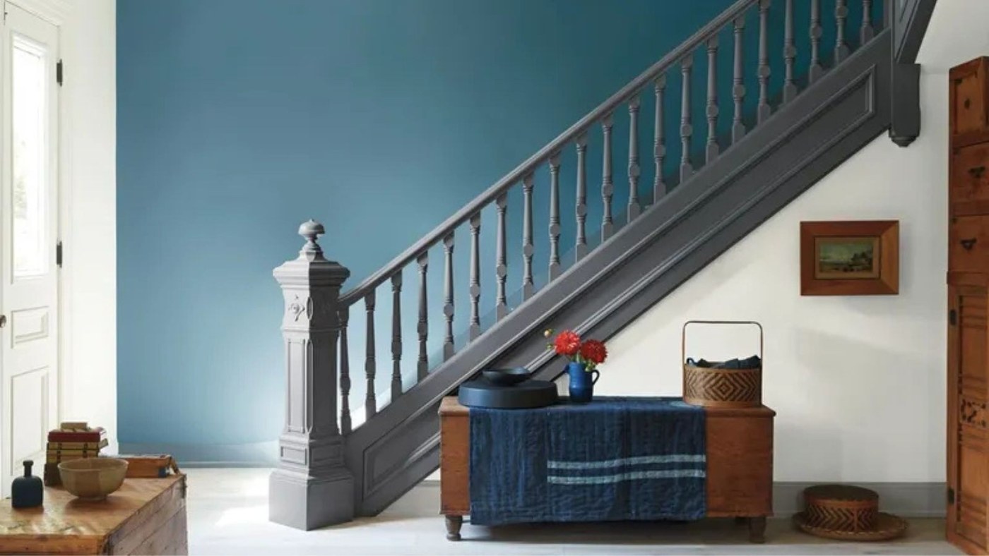
A Whole-Home Palette for Richer Color
Deep green, berry, and quieter supporting shades offer a coordinated approach to maximalist color.
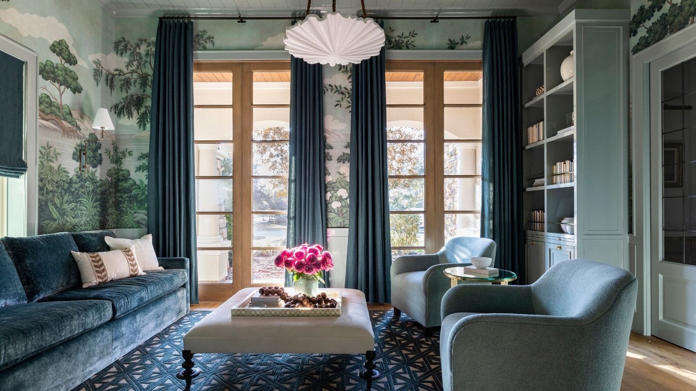
One Color Can Still Create a Layered Room
Different tints and materials give a monochromatic scheme depth.
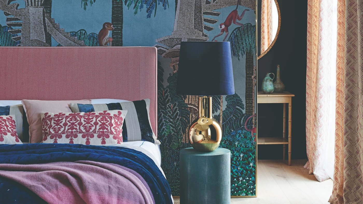
Give an Accent Color a Defined Role
A smaller amount of stronger color can connect furnishings and details.
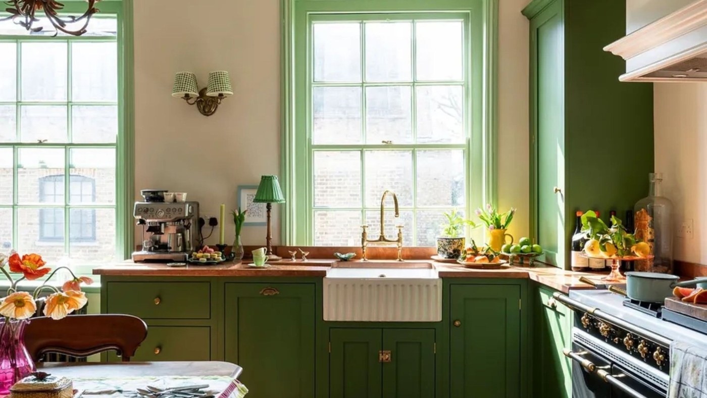
Wood Undertones Connect Light and Dark Kitchen Finishes
Related underlying colors can keep different timber surfaces from looking like an accidental mismatch.
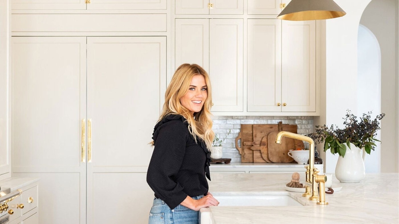
Limit the Wood Palette Before Mixing Kitchen Finishes
Two considered timber tones can provide either a close relationship or a deliberate contrast.
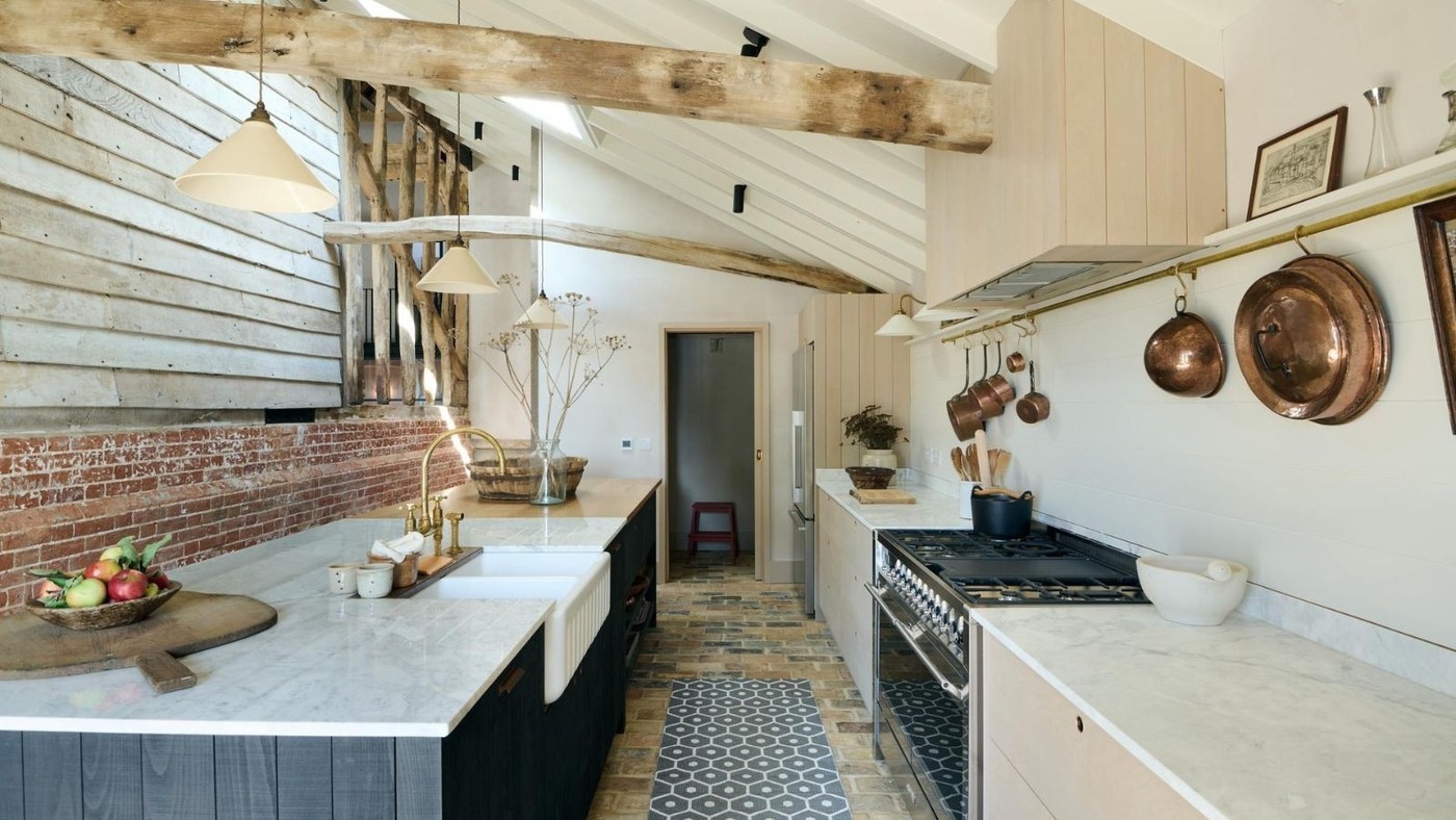
Mix Kitchen Wood Tones with Intentional Contrast
Different cabinet, island, and beam finishes can belong together when their relationship is clear.
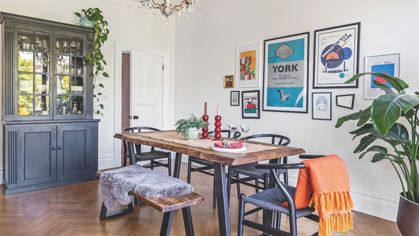
Preparation Gives Painted Wood a Better Foundation
Primer and a suitable coating support the finish on existing furniture.

