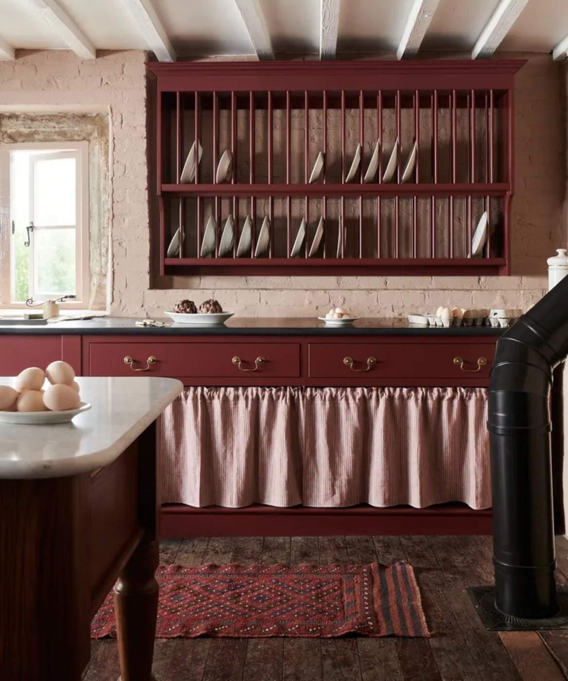
Winter Color Can Be Rich without Covering Every Wall
The winter palette in this reference includes deep reds, purples, browns, and nature-inspired greens alongside quieter neutrals. Burgundy receives particular attention for its grounding effect. A chair, sofa, or cushion can introduce the color when a complete room treatment would feel too strong.
Consider the surrounding materials and available light before choosing the scale of the change. Richer hues can make a winter room feel more enveloping, while lighter neutral surfaces retain balance. A seasonal adjustment can therefore begin with a textile or furniture accent rather than a permanent repaint.
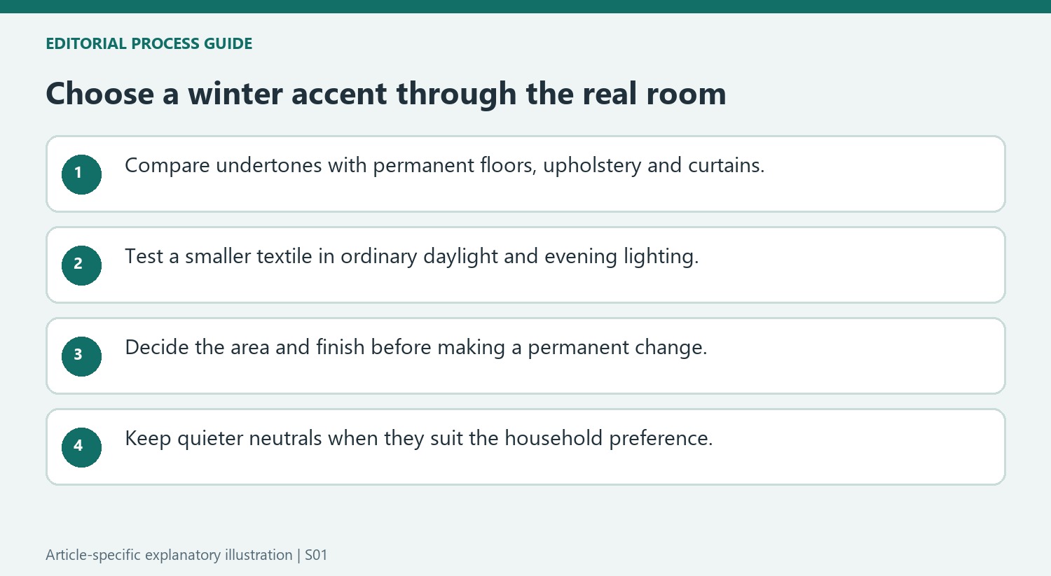
Compare the undertones rather than choosing by season alone
The designers in the source propose burgundy, brown, plum, green, neutrals, and blue, with different reasons for each choice. Cheryl Clendenon relates muted greens to warm neutrals and vintage brass; Rosanna Bassford favors camel as a warmer companion to winter white. These are starting points for comparing the room's existing surfaces. The examples emphasize how differently colored objects relate to surrounding finishes. Place a sample beside the sofa, floor, and curtains instead of judging it as an isolated winter shade.
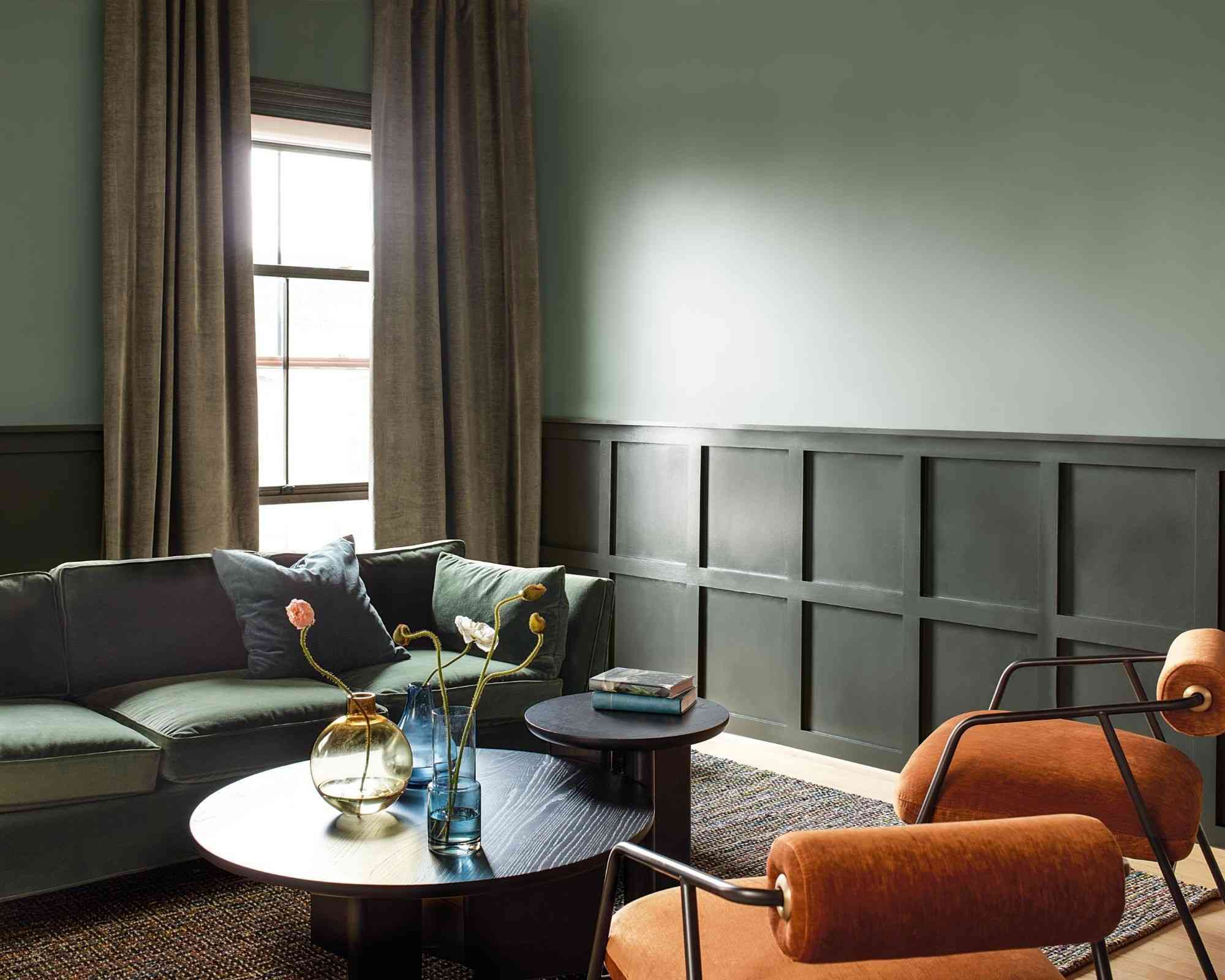
Adjust the size of the color commitment
Bethany Adams describes burgundy as useful in both an enveloping scheme and a single cushion. The source also distinguishes stronger peacock blue from quieter gray-blue and discusses plum with brown or red undertones. A small textile can test one of these relationships before repainting a whole room. Consider the room's changing daylight and evening lighting when comparing samples. The article reports designer preferences, not a rule that a rich color must occupy every wall or that a particular shade will suit all orientations equally.
Relate a richer accent to the permanent room
The designers describe several ways a winter color can sit beside existing finishes. Brown can support greenery and warm decorative lights; muted green can connect with timber and aged brass. Begin with the room's larger fixed surfaces and identify which of those relationships already exists before selecting a new cushion, chair or paint sample.
A color name alone is too broad to settle the result. Two burgundies may differ in darkness and undertone, while one blue may feel quieter than another. Compare the exact material in the room rather than assuming that a retailer's winter description guarantees a warm effect. The source offers designer preferences as starting points for that comparison, not measured outcomes for every interior.
Test a smaller commitment before choosing a permanent finish
A removable textile can show whether a stronger hue feels useful beside the sofa or bedding. Move it between the intended positions and view it under the ordinary lamps as well as daylight. This allows the household to judge the relationship in use before choosing a larger upholstered piece or a whole-room treatment.
The article's more enveloping paint examples represent a different scale of commitment. Consider the actual amount of wall surface, the adjoining rooms and the existing furnishings before borrowing that approach. A saturated accent and a saturated room are distinct decisions, even when the color family is the same. Keep the desired atmosphere and maintenance of the whole room in view.
Allow quieter neutrals to remain part of the winter palette
Cream, ivory and camel appear in the feature alongside deep jewel-like shades. This provides an option for households that prefer lighter surroundings. Texture can give those quieter colors depth, allowing a velvet or woven accent to feel distinct without requiring a much darker palette or an explicitly festive motif.
The suggestions also extend beyond one holiday. Choose a color that remains enjoyable when seasonal foliage and ornaments are removed, rather than treating a trend discussion as a deadline for replacement. Check current samples and exact product details when purchasing. The useful decision is how a chosen shade supports the existing materials and daily experience, with its area, finish and lighting considered together rather than relying only on a seasonal label.
References
- These rich-looking colors are favorites among designers for winter decorating – 6 sophisticated shades. Homes and Gardens; Emily Moorman.
Burgundy introduces depth through a single furnishing as well as a larger paint scheme.


Leave a Comment
Comments (0)