Bedroom Colors with Depth and Warmth
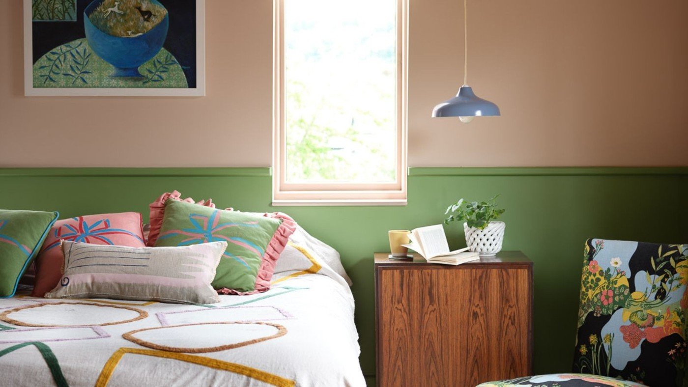
A bedroom palette can feel quiet without relying on an entirely white room. The reference highlights deep, muted greens including Caldwell Green, Peale Green, and Tate Olive. Natural wood, linen, and wool give these richer shades a warm setting rather than leaving the painted walls to provide every decorative detail.
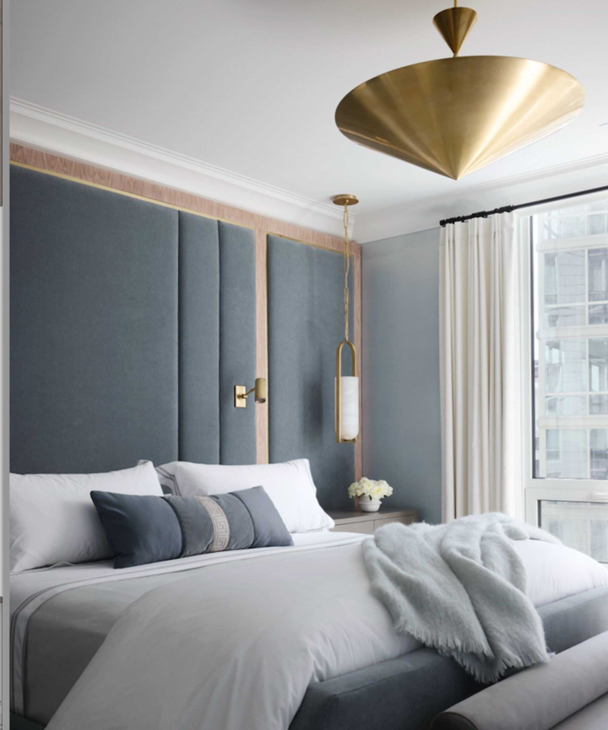
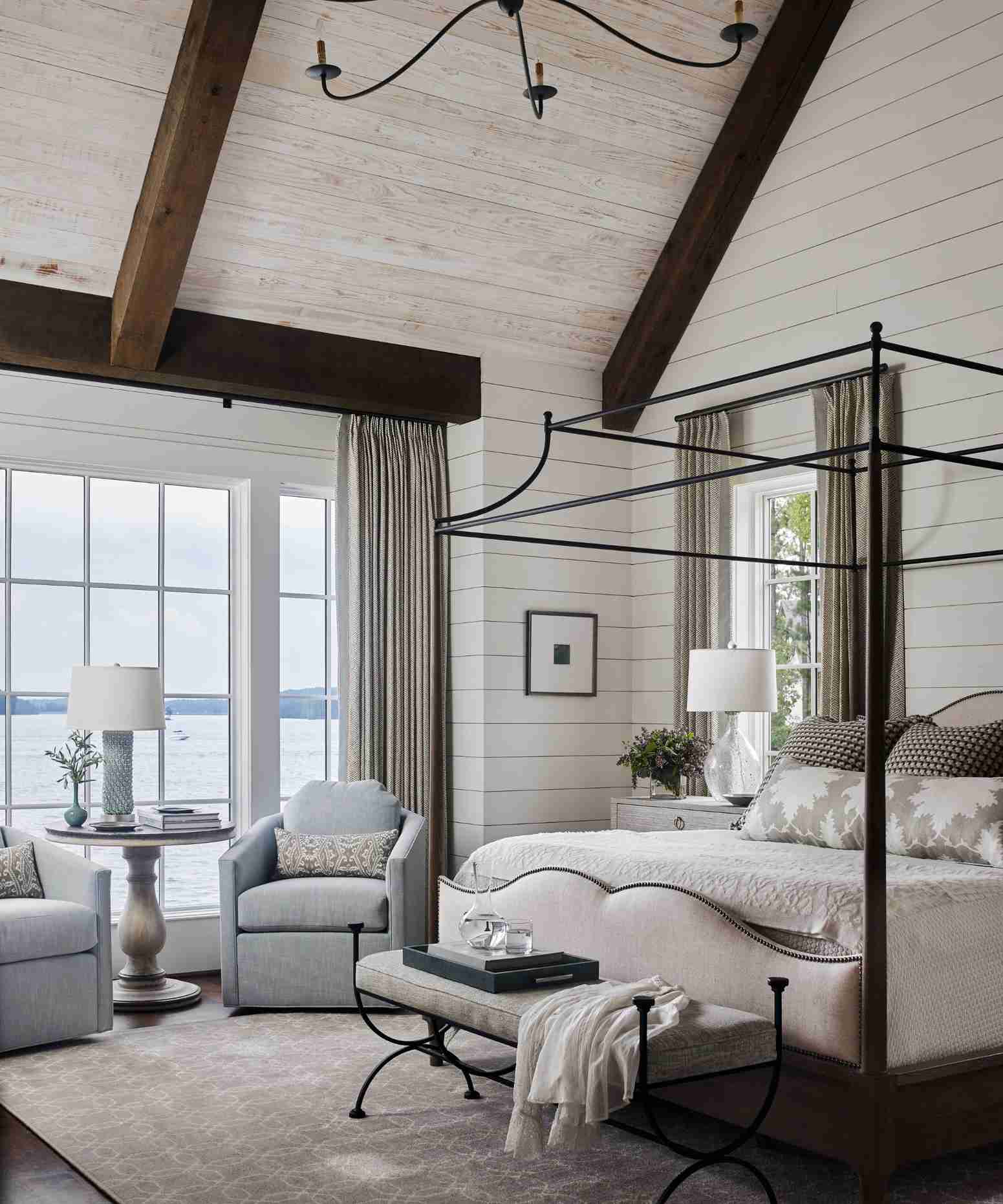
Blue-gray and green-gray offer a softer alternative when balanced with warm wood. For a lighter approach, warm white walls can support gentle accents through pillows, lamps, and curtain trim. Assess the complete combination of paint and textiles instead of assuming a single color will determine the atmosphere of the bedroom.
Compare two different routes into green
The source includes deep muted greens such as Benjamin Moore's Caldwell Green, Peale Green, and Tate Olive, along with earthier alternatives. The designers pair these with warm neutrals, wood, linen, and wool rather than treating green as a stand-alone solution. A darker shade can provide a more enveloping effect, while a softer accent gives a lighter room a smaller color change. Test the actual paint beside the existing finishes instead of relying on a name or an online swatch.
Let undertones link the warmer and cooler elements
Blue-gray and green-gray are presented as options that retain a fairly restrained character, especially beside warmer timber. Another direction starts with a pale neutral foundation and introduces soft color through curtain trim, lamps, cushions, or a throw. Those smaller components are easier to alter than the full wall scheme. The article's date reflects a trend discussion at publication, not an expiry date for an existing bedroom. Choose the combination for its present light, materials, and the occupant's preferences rather than assuming a fashionable shade is necessary for rest.
Choose the amount of depth before the named paint
The Homes and Gardens roundup spans deep greens, blue-greys, warm whites, softer mineral greens, plaster pinks, and richer red-purple options. This breadth makes it useful as a comparison of directions rather than a single fashionable answer. First decide whether the bedroom needs a deeper backdrop, a pale foundation, or a limited accent. Then compare the intended shade with the largest existing textile and the floor. Cheryl Clendenon's green examples are paired with linen, wood, wool, and warm neutrals; those neighbors explain part of the effect. A color name alone cannot reproduce the photographed room. An illustrative material board can reveal whether the desired depth already exists in a headboard or whether the wall would provide a new, useful relationship.
Let the supporting materials bridge warm and cool tones
Brynn Olson describes blue-grey with warmer wood and natural materials, while Liz Williams favors a neutral base with softer accents. Those are different ways to distribute color. A warm timber nightstand might connect a cool wall with cream bedding, whereas a pillow or curtain trim could introduce the same accent with less commitment. Compare actual samples together rather than judging each shade against a white shop background. Plaster-toned pink is another possible near-neutral, but it should be assessed for its own undertone alongside the existing finishes. The source's suggestion that a paint color changes light-related physiology should not be treated as established evidence. Reflected wall color, a lighting product, and a medical intervention are different subjects and should not be conflated.
Keep the trend year separate from the room's useful life
The feature is framed around a particular year's designer preferences. Its examples can still inform a later project, but the date does not make a satisfying existing palette obsolete. Choose the shade for the actual room's daylight, evening lamps, furniture, and occupant. A deeper red-purple may need a quieter adjacent textile; a pale scheme may benefit from a more tactile surface rather than a stronger wall color. These are design relationships to test, not guarantees that any shade produces identical emotions or sleep outcomes. Make a limited sample comparison first, keep the colors that remain appealing in normal use, and assess the product's suitable finish and care separately from the visual trend description.
References
- Bedroom color trends 2025 – 10 shades interior designers are using for the most stylish sleep spaces. Homes and Gardens; Emily Moorman.
Muted greens, softened grays, and warm whites offer several routes to a restful-looking bedroom.


Leave a Comment
Comments (0)