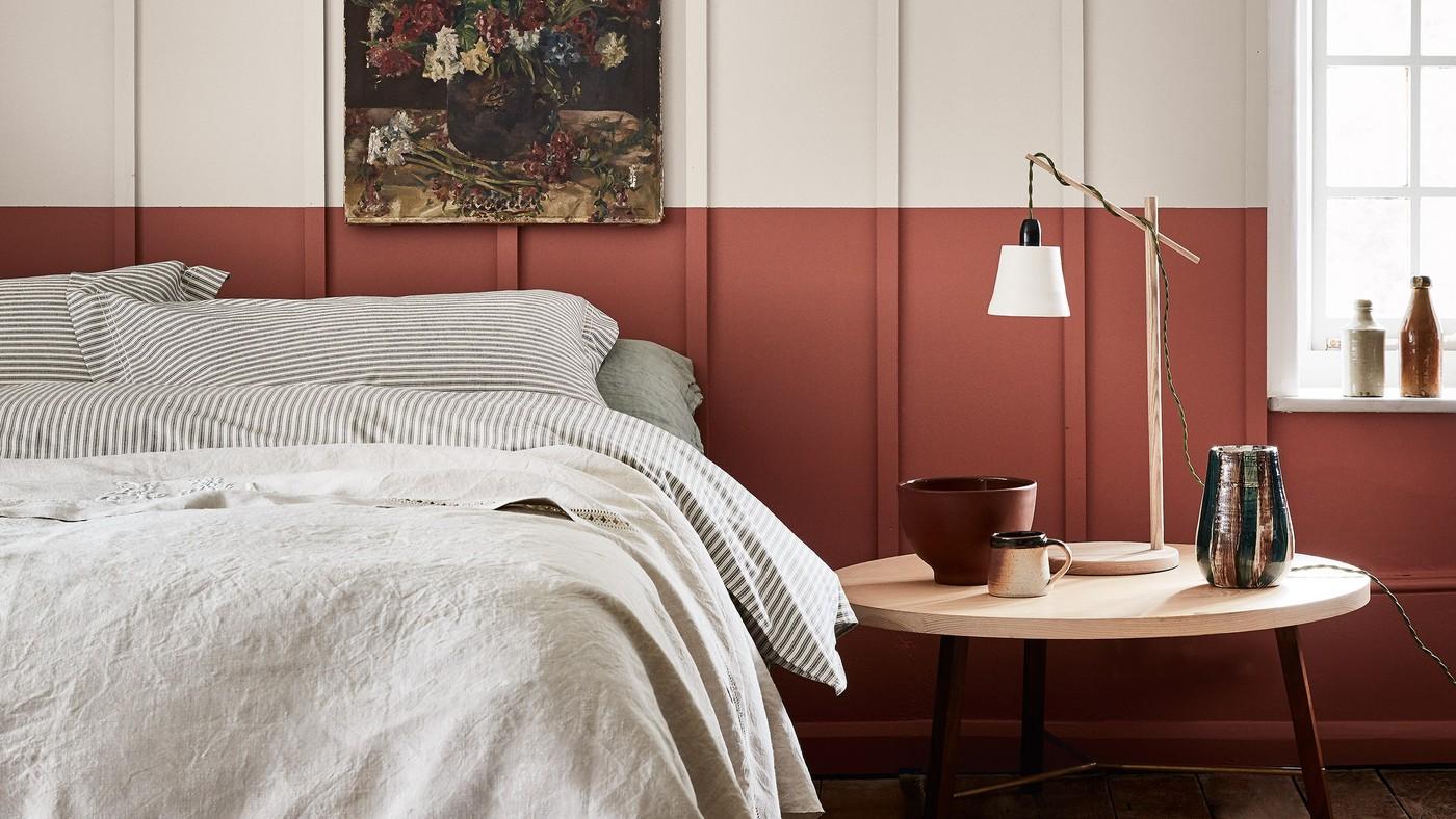
Move a Cool Bedroom Palette toward More Warmth
The bedroom color discussion in this reference describes a move away from very cool white and gray schemes. The designers favor more warmth and depth over an entirely stark treatment. This is a direction for consideration rather than a reason to discard colors that already work well.
Assess the existing light and textiles before deciding what feels missing. A warmer variation or supporting fabric can shift the atmosphere without replacing every finish. Select colors for their relationship to the room and its occupants rather than treating forecasts as fixed requirements.
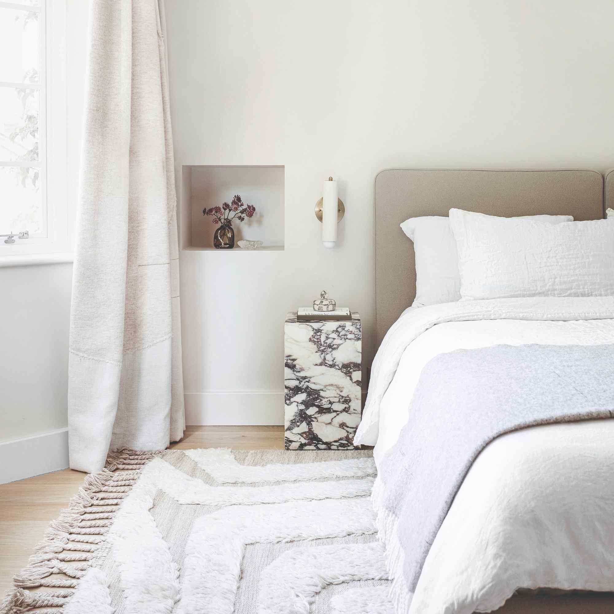
Add warmth through more than the paint
The quoted designers favor sandy taupe, chalky stone, warm beige, and layered natural-looking textures as alternatives to a stark gray or cool-white scheme. Their examples emphasize several related tones rather than one flat color covering every object. Compare the undertone of existing bedding and flooring before choosing a warmer wall color; replacing paint alone may leave the larger material relationships unresolved.
Adapt an existing cool room before replacing everything
The source also notes that gray can be balanced with softer texture and warmer accents. That offers a more limited intervention than treating every cool shade as obsolete. A carefully selected tactile woven throw in a warmer tone, warm natural wood detail, or revised bedside lighting can be assessed individually before a major redecoration. Trend forecasts are designers' interpretations of current preferences, not universal judgments about a household's taste or evidence that a warm palette has a guaranteed medical benefit. Keep the elements that remain comfortable and useful, then decide whether the room needs a small tonal correction or a broader new scheme.
Diagnose what feels cold before choosing a replacement
The Ideal Home trend report moves from cool white and grey toward warmer neutrals and softened natural shades. Its useful question is which part of an existing room actually creates the unwanted effect. A grey wall beside flat matching textiles may feel different when wood, a warmer throw, or a textured fabric is introduced. Katerina Tchevytchalova explicitly allows warmer accents to rebalance cool grey, so the article need not be read as an instruction to repaint every grey bedroom. Review the largest surfaces together and identify one missing relationship. A small change may clarify whether a complete wall-color project would add anything worthwhile. The occupant's continued enjoyment matters more than whether a published trend calls a shade outdated.
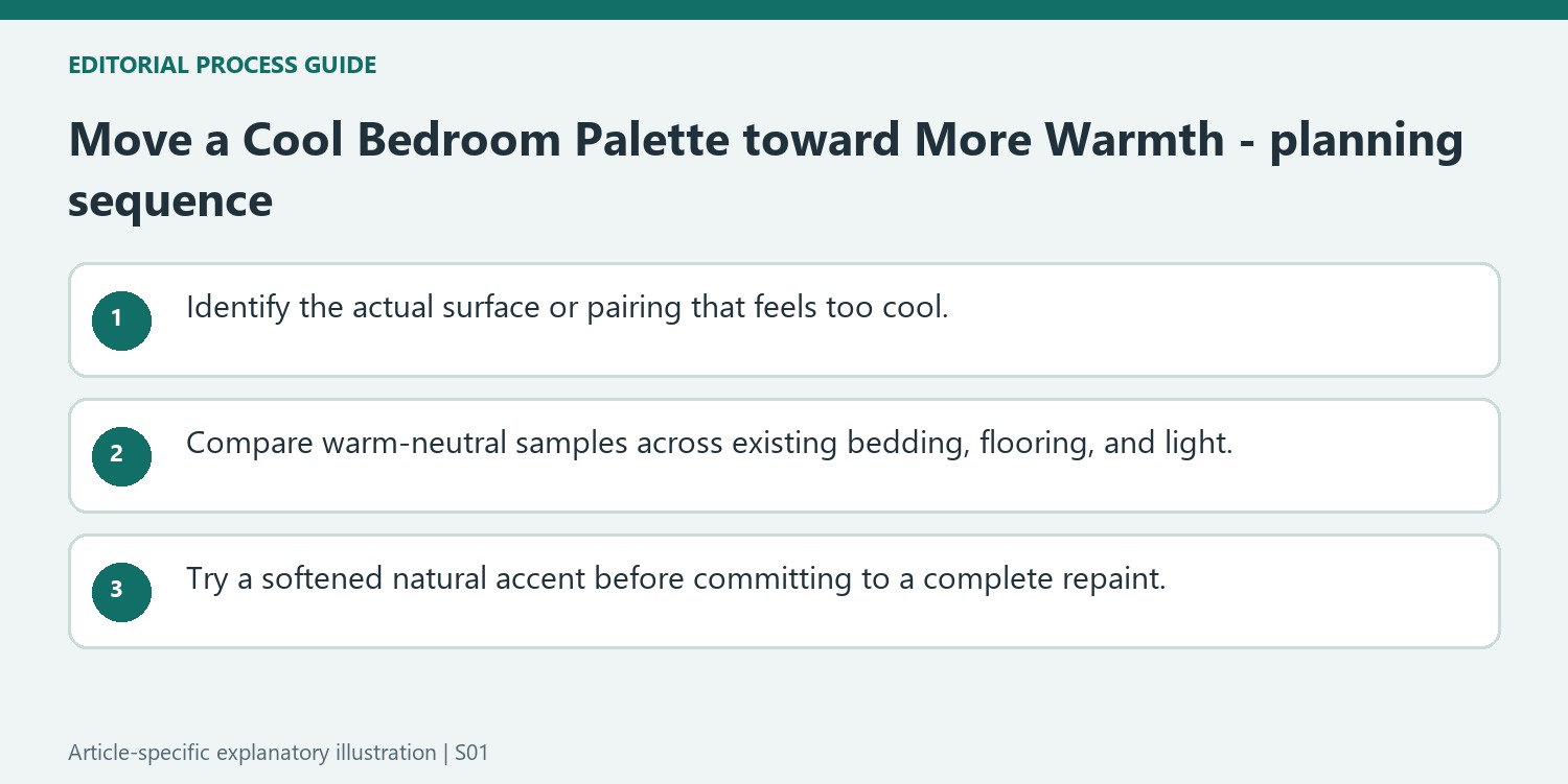
Compare warm neutrals through several related surfaces
The contributors mention sandy taupe, chalky stone, warm beige, and soft whites. Their differences can be subtle, especially when each is viewed alone. Compare samples beside the actual bed linen and floor, then check them in ordinary daylight and evening illumination. Layering in this context means visible variation in tone and material, not necessarily more cushions or furniture. A warmer textile can sit against a cooler background while the overall palette remains restrained. The source's landscape comparison is useful for understanding a family of related shades, but no natural setting supplies a compulsory formula. Keep the surfaces that work together and avoid selecting several nearly identical products simply because their names all suggest sand, stone, or warmth.
Test a muted accent without treating it as a health prescription
Sage, olive, clay, and terracotta are among the article's alternatives to icy pastels and vivid primary accents. Their value is the possibility of a softer visual relationship with timber and linen. An illustrative trial introduces one textile or sample panel before replacing the main furnishings. Compare how much of the accent is visible and whether it still suits the room at night. The contributors' language about emotional reassurance and restoration communicates a design intention, not proof that a paint scheme treats stress or sleep problems. Likewise, a person who enjoys a bright or cool bedroom is not required to abandon it. The practical outcome is a palette that feels appropriate to its actual user, with changes made in proportion to the problem being solved.
References
Undertones can change a room without requiring an entirely different style.


Leave a Comment
Comments (0)