One Color Can Still Create a Layered Room
A monochromatic palette uses variations of one color rather than repeating an identical finish everywhere. Tints, shades, and tones provide differences within the same family. The reference includes both colorful rooms and quieter neutral interiors to demonstrate that range.
Texture and proportion help the individual surfaces remain distinct. A darker furnishing can anchor lighter walls, while textiles introduce another layer. Judge the complete arrangement before deciding that a one-color scheme must feel flat or require a strongly contrasting accent.
Distinguish one color family from one identical surface
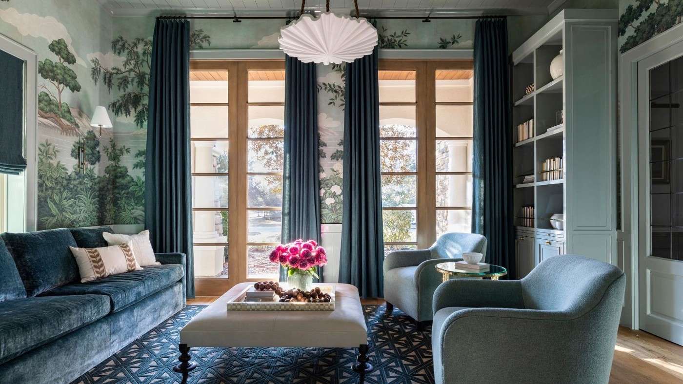
The source defines a monochromatic scheme through variations in tint, shade, and tone. That leaves room for light and dark blues, or several related neutrals, within a coherent room. Marie Flanigan's example carries blue through wallcovering, cabinetry, and upholstery, using changes in material to prevent sameness. The room can remain blue throughout while curtains, cabinets, and upholstered furniture show different levels of depth and softness. Start by selecting the family, then assign different depths to the surfaces that need separate emphasis.
Let texture and sheen supply some of the contrast
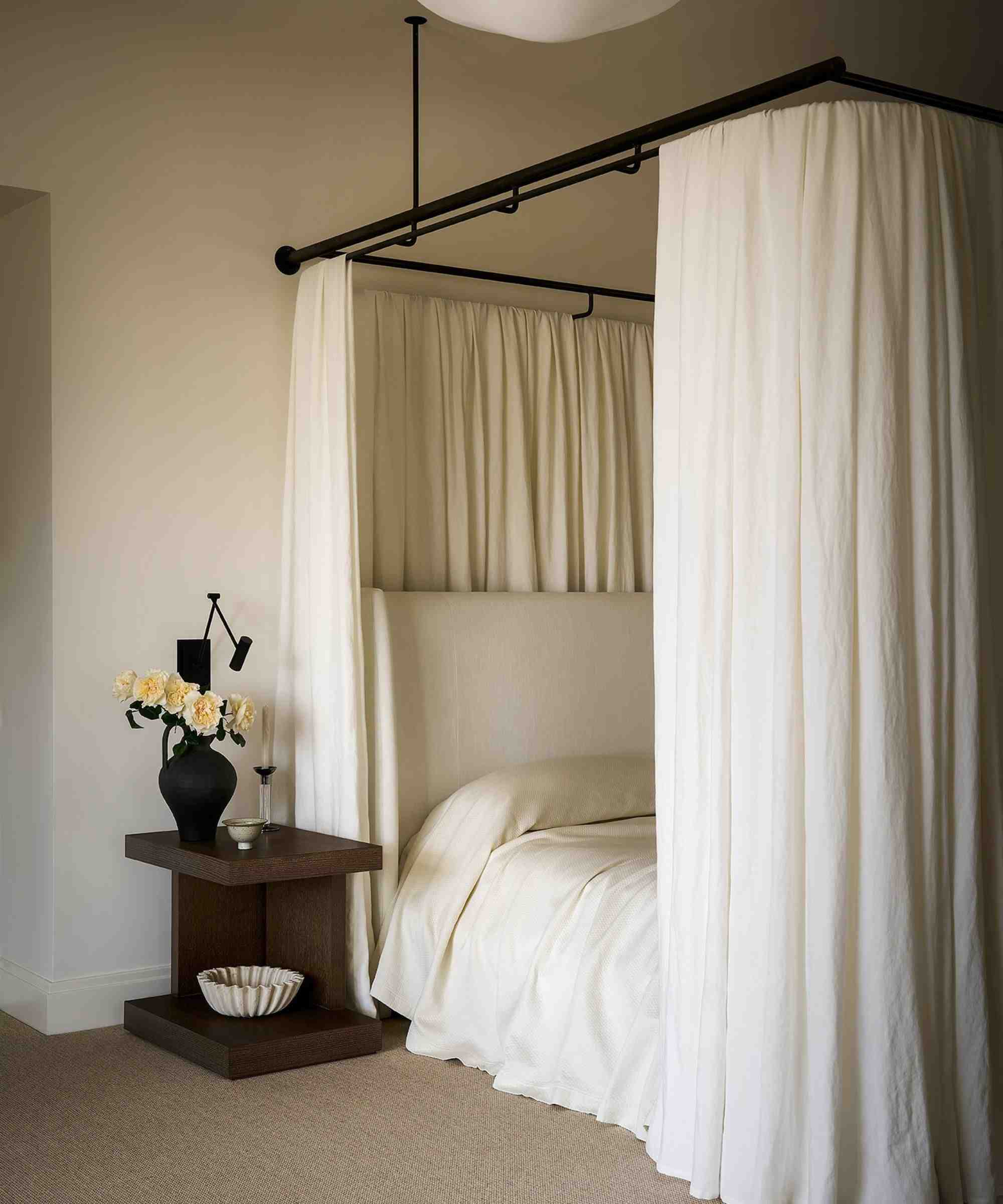
Diana Wagenbach's neutral bedroom combines warm white with limestone and ivory drapery. Another example uses a dusty pink in a glossier finish, giving a restrained color a more reflective presence. These show that the same broad palette can support quite different atmospheres. Compare fabric, paint, stone, and glass in the room's actual light rather than assuming similar colors will automatically appear layered. Keep at least a few changes of surface or value perceptible from across the space, and choose the finish for the material's practical requirements as well as its visual effect.
Define the family before choosing how many shades to include
A monochromatic scheme uses variations of one color rather than requiring every object to match a single swatch. The source's blue rooms distribute that family across walls, cabinetry, upholstery, glass, and smaller accents. Start with the surface that will lead and compare a lighter and deeper companion against it. A material board can show whether the differences remain legible or disappear into one flat area. The same method can apply to warm neutrals, where limestone, ivory fabric, and a painted surface have related tones but different physical qualities. The number of objects is not what makes the scheme coherent. Their relationship within the selected family and their different roles in the room provide the structure.

Make sheen and texture carry part of the contrast
Lisa Frantz's dusty-pink room uses a glossy finish to change how the color reads, while Diana Wagenbach's neutral bedroom relies on stone and fabric variation. Those examples show that monochrome does not mean one uniform surface. Compare matte, woven, polished, or translucent elements beside the dominant color and decide which contrast is missing. A glossy coating also reveals and reflects light differently, so its appearance should be tested on the actual intended surface. The paint product needs suitable preparation and application regardless of the visual scheme. A single well-chosen textile may be enough to make the layering visible; adding several similar accessories can create clutter without introducing a meaningful difference in tone or texture.
Choose pale or saturated continuity for the room's real use
The article includes both lighter neutral spaces and darker, more enveloping living rooms and libraries. These are alternative applications of a shared principle, not evidence that monochromatic decorating must be quiet or that dark paint always makes a room cozy. Compare the intended palette under the light used for reading, conversation, or evening relaxation. Existing artwork or a small contrasting material need not be removed merely to preserve a strict label. The designers' examples allow subtle departures while keeping one family dominant. Select a scheme that leaves the room functional and personally appealing, then assess how the major surfaces connect. A useful monochromatic room is a layered composition, rather than a test of whether every belonging can be made exactly the same color.
References
- Monochromatic color schemes – 9 single-color rooms that master this trend. Homes and Gardens; Emily Moorman.
Different tints and materials give a monochromatic scheme depth.


Leave a Comment
Comments (0)