Category News
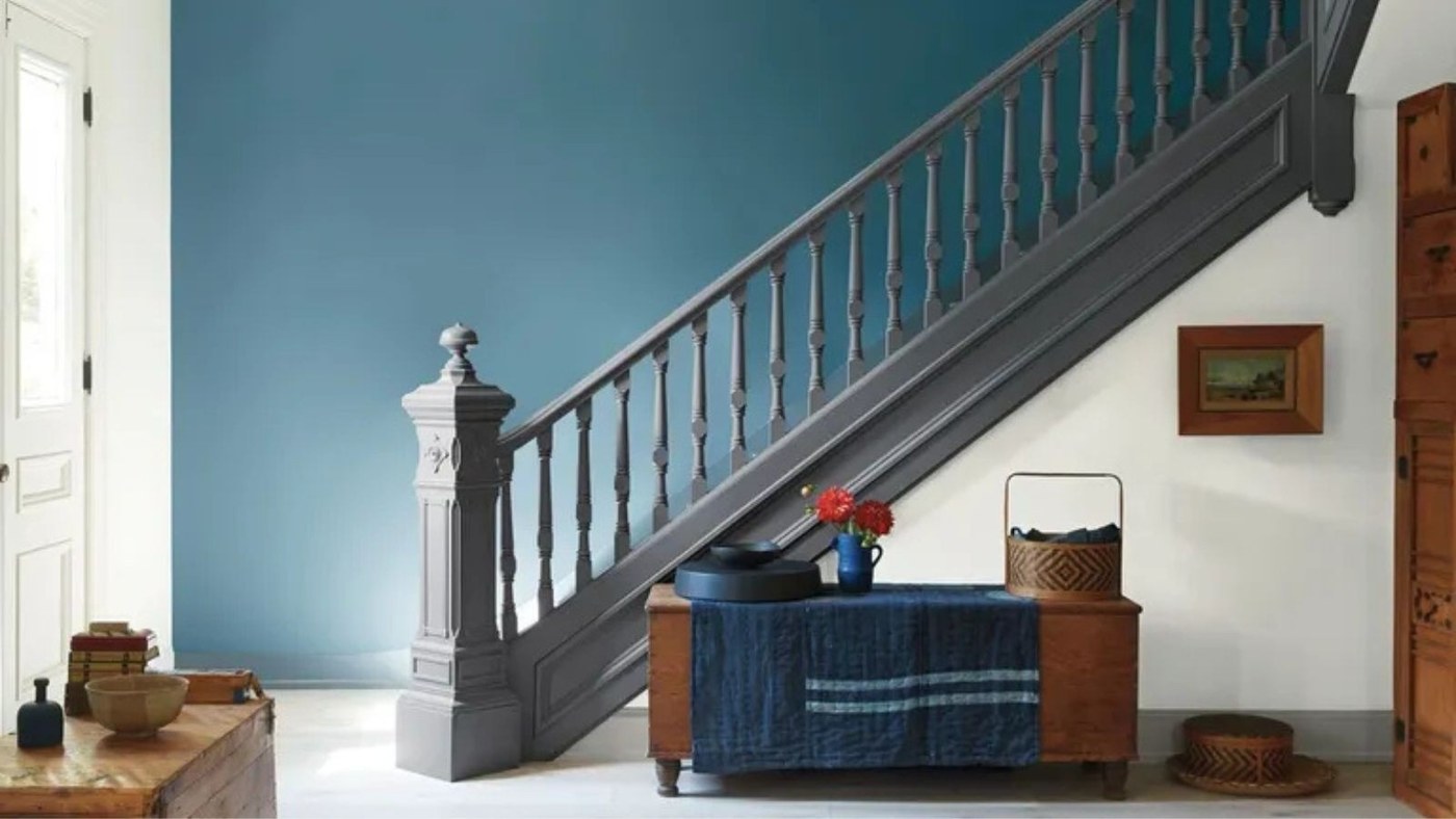
A Whole-Home Palette for Richer Color
Deep green, berry, and quieter supporting shades offer a coordinated approach to maximalist color.
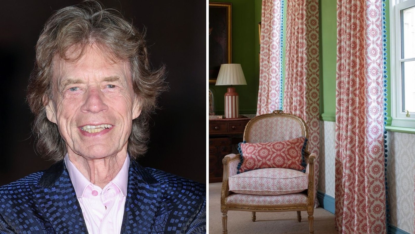
Warm Accents Bring a Neutral Studio to Life
Red curtains, a rust rug, and a yellow lamp animate a white-and-wood setting.
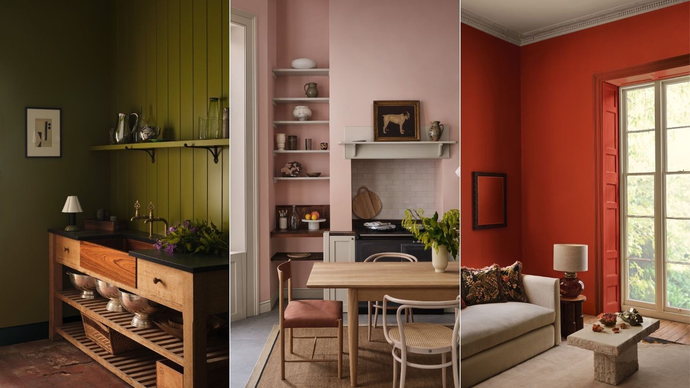
Mineral Colors Inspire a More Saturated Palette
Paint & Paper Library's Jewels collection uses nature beyond familiar greens.
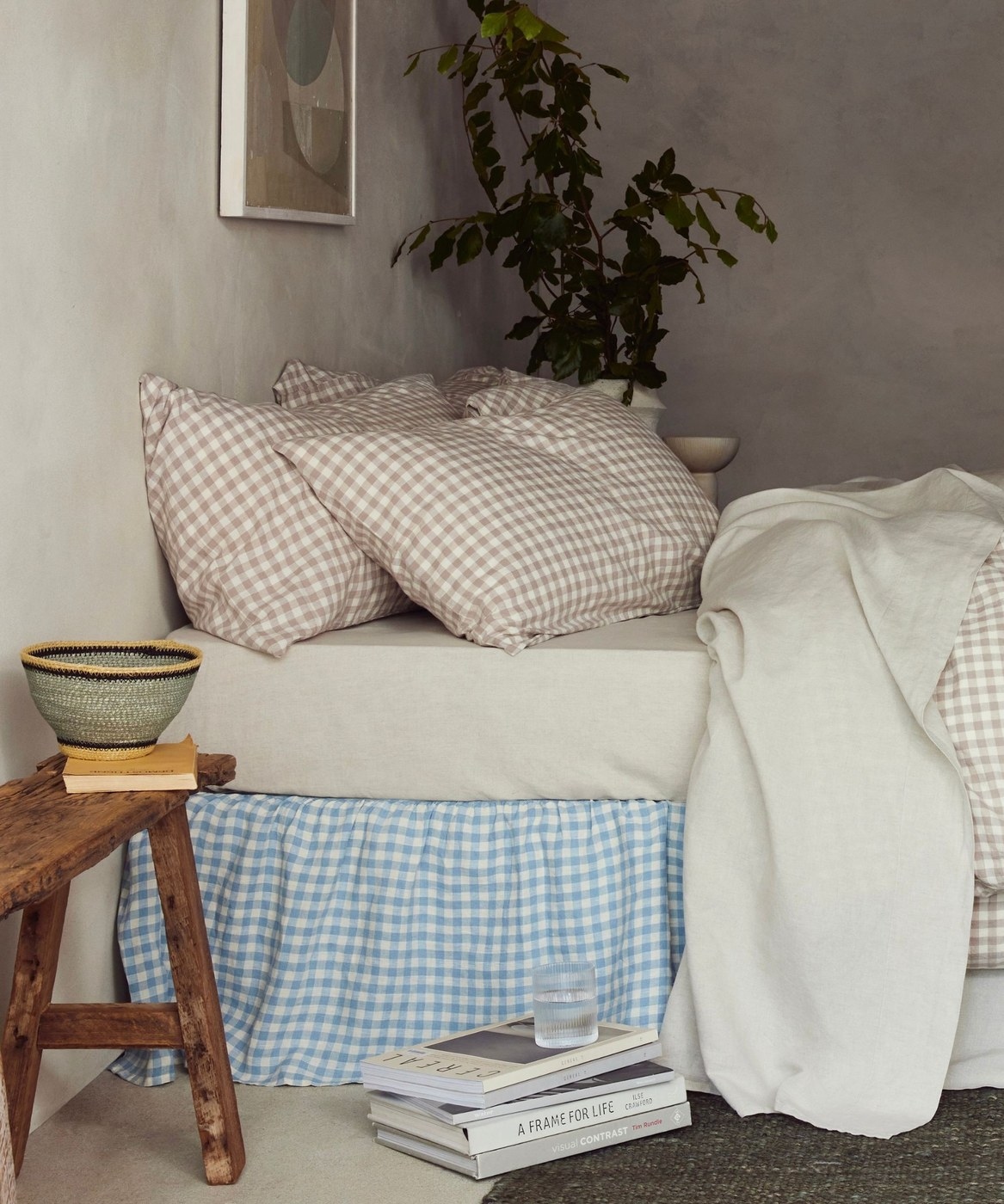
Introduce Earthy Color into a Neutral Home
Mid greens, terracotta, rust, and other grounded shades can add character without replacing a restrained foundation.
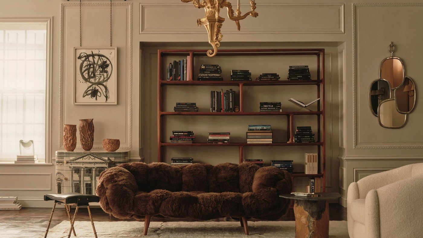
Let Texture Give a Quiet Interior More Depth
Differences in sheen, grain, and softness can make a restrained palette feel richer.
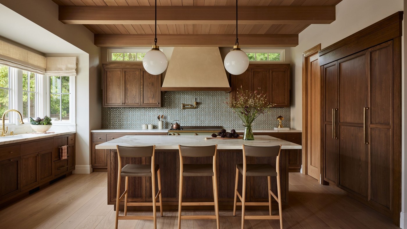
Warm Kitchen Colors beyond Bright White
Wood, earthy green, and softened yellow create different kinds of warmth.
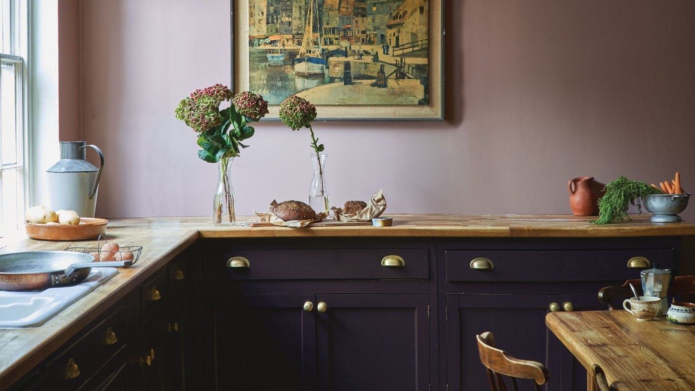
Heritage Colors with a Softer Supporting Palette
Earthy green, oxblood, and plaster pink can bring historical character to a modern home.
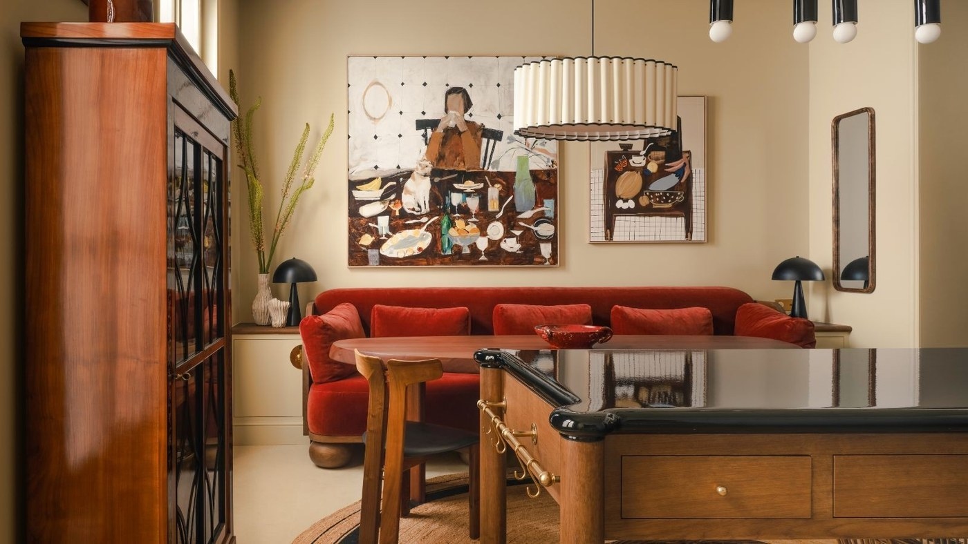
Warm Interior Colors Can Go Deeper Than Beige
Muted brown, natural timber, and grounded accents offer a richer alternative to an all-beige room.
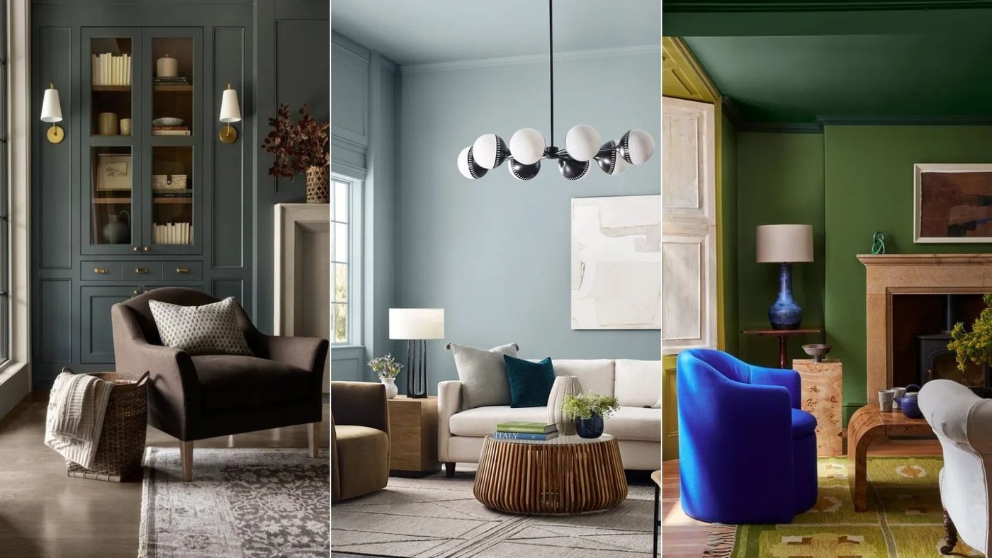
Balance Cool Interior Colors with Warm Materials
Undertones, lighting, and metal finishes help blues, greens, and grays feel considered rather than chilly.
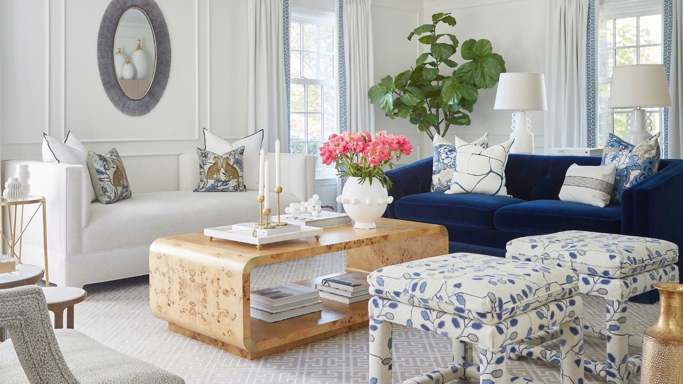
Traditional Rooms Can Balance Cool Colors with Warm Details
Soft blues, greens, and off-whites gain depth through timber, brass, and tailored architectural elements.

Light Wood Brings Warmth to a Monochrome Interior
Beams, flooring, furniture, and smaller timber accessories can soften the relationship between white and black.
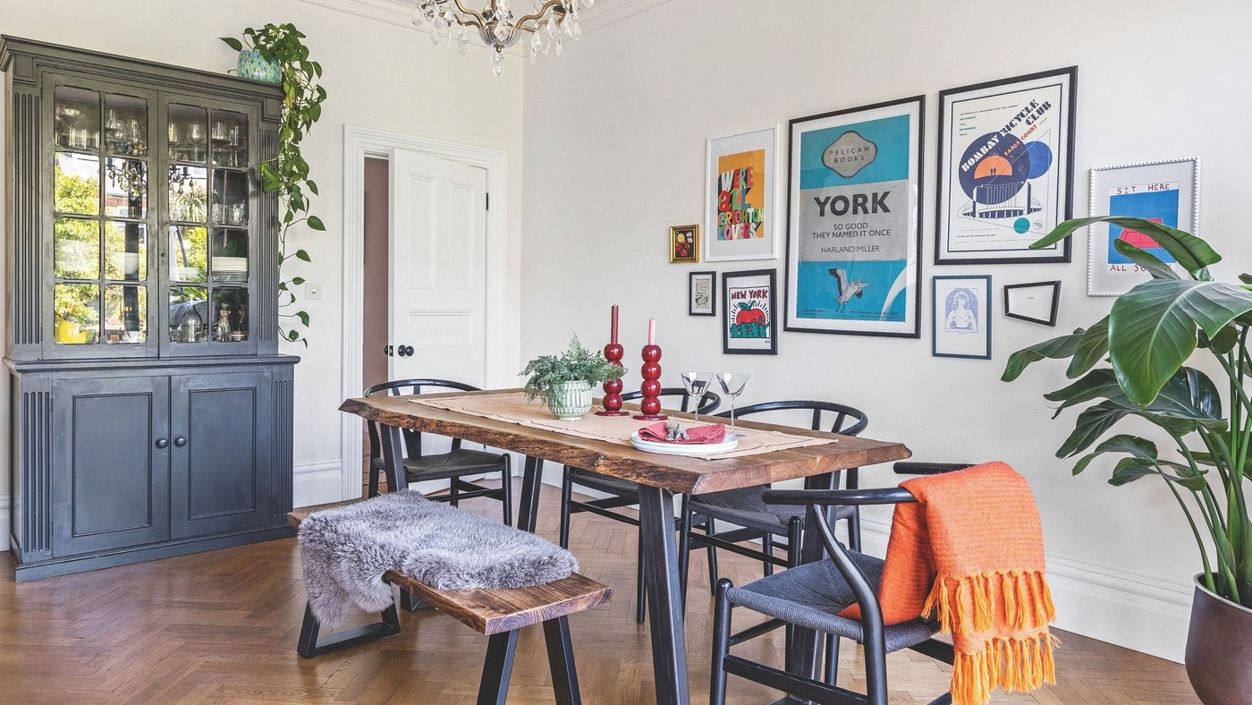
Preparation Gives Painted Wood a Better Foundation
Primer and a suitable coating support the finish on existing furniture.
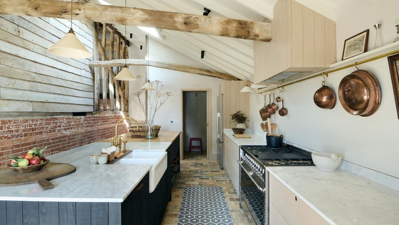
Mix Kitchen Wood Tones with Intentional Contrast
Different cabinet, island, and beam finishes can belong together when their relationship is clear.
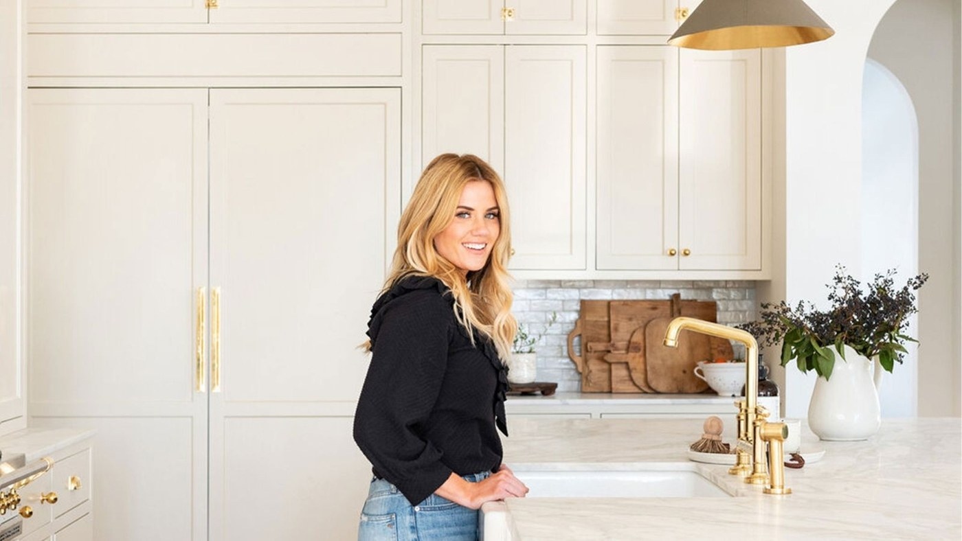
Limit the Wood Palette Before Mixing Kitchen Finishes
Two considered timber tones can provide either a close relationship or a deliberate contrast.
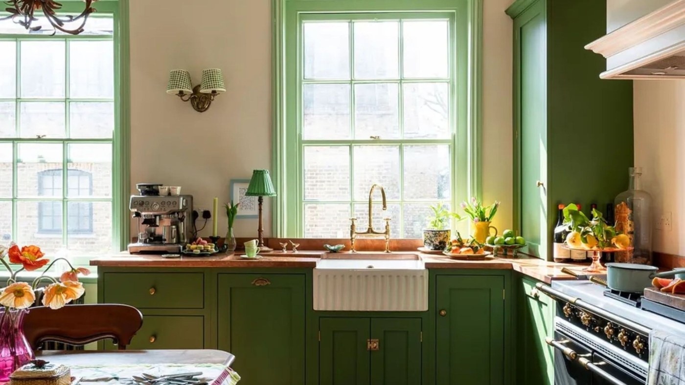
Wood Undertones Connect Light and Dark Kitchen Finishes
Related underlying colors can keep different timber surfaces from looking like an accidental mismatch.
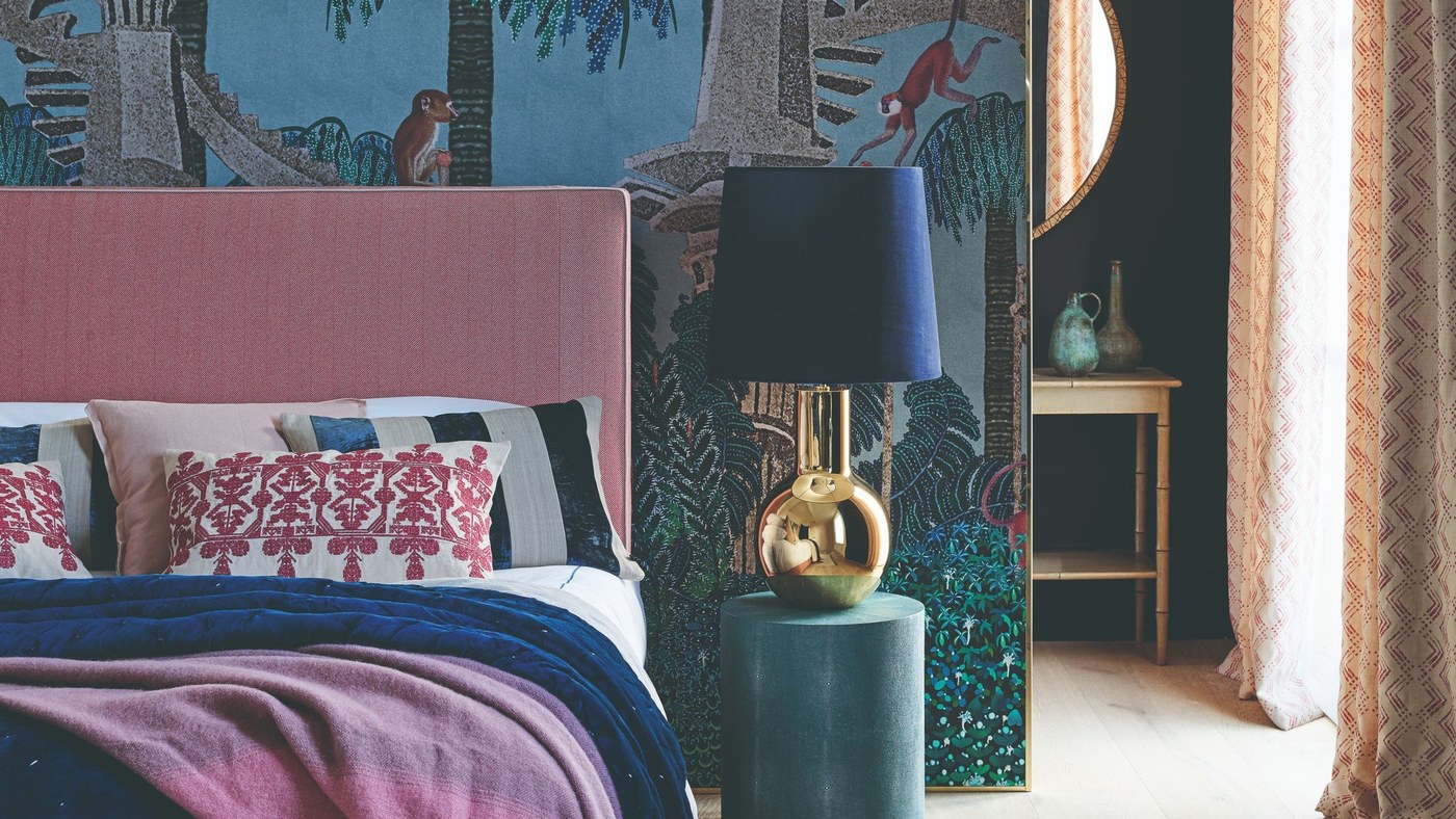
Give an Accent Color a Defined Role
A smaller amount of stronger color can connect furnishings and details.
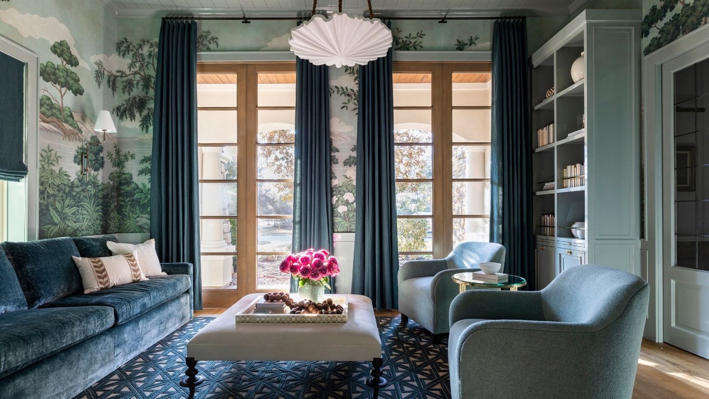
One Color Can Still Create a Layered Room
Different tints and materials give a monochromatic scheme depth.
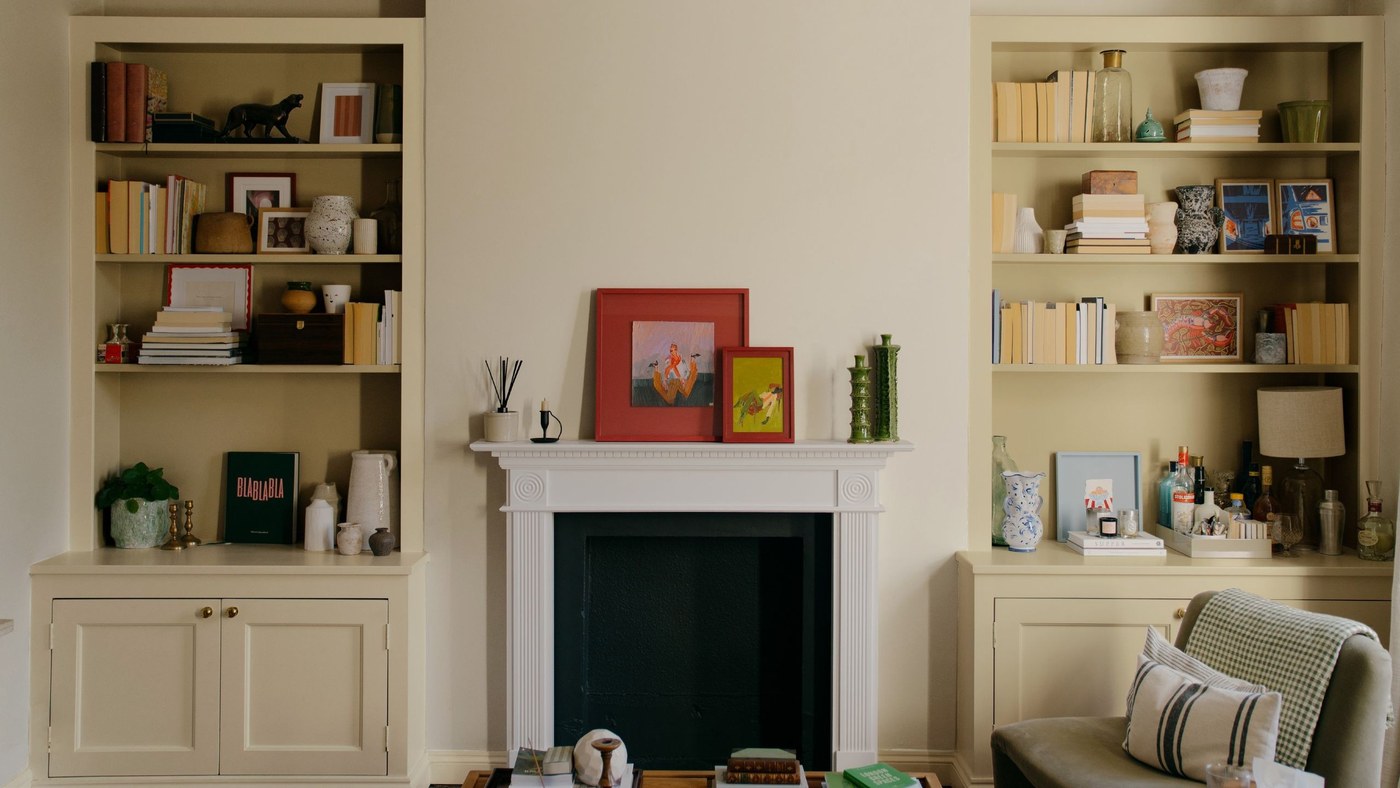
Assess Paint Color in the Light Where It Will Be Used
COAT's expanded range places emphasis on UK interiors.

Pink Pillows Bring Focus to a Neutral Living Room
A small area of pink can add warmth and character while leaving the main room palette restrained.
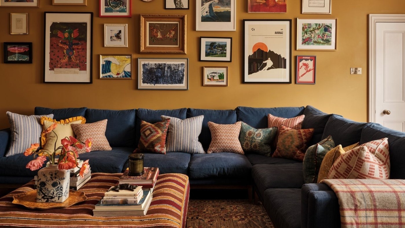
Choose Living Room Color for the Way the Space Is Used
A durable palette connects walls, furniture, and everyday activities rather than relying on a trend alone.

