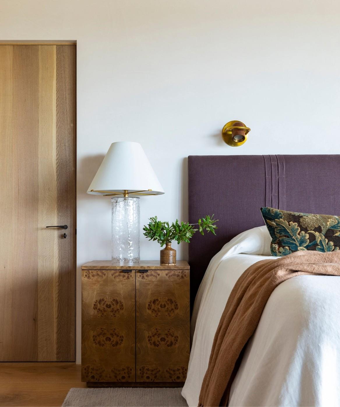
Give White and Warm Neutral Bedrooms Depth
Build a scheme instead of choosing one shade
The reference approaches bedroom color as a relationship between surfaces rather than a search for one fashionable paint. In its white-bedroom example, fresh bedding works alongside earthy tones and tactile materials. Those supporting details keep the pale setting from appearing clinical. A deeper accent can ground the arrangement, giving the eye something to connect with among the lighter walls, bed linen, and furniture.
Read the undertone before adding furnishings
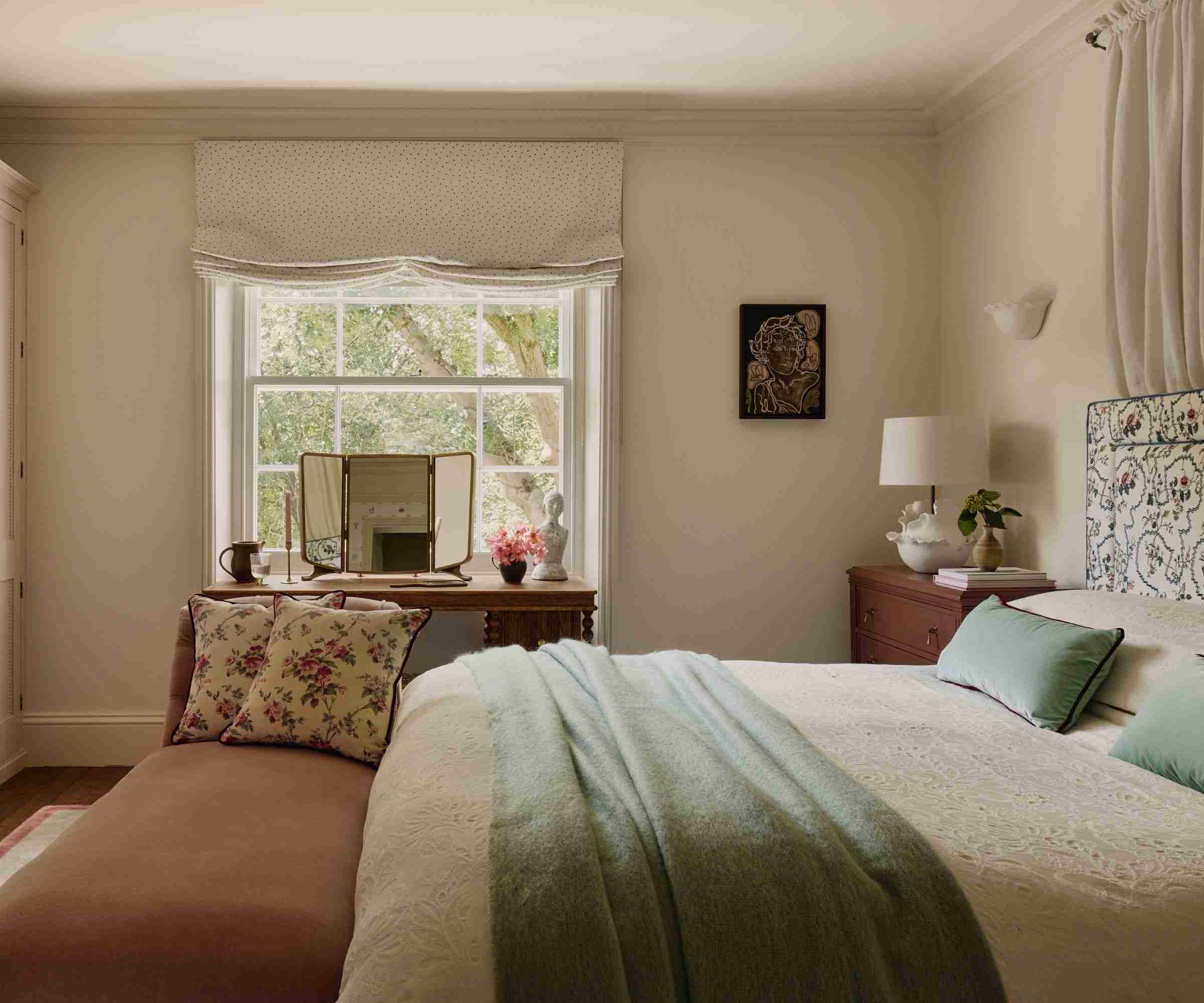
A warm neutral offers a softer alternative to a crisp white. The featured taupe-toned bedroom works with patterned textiles, a wooden desk, and deep red painted furniture. Its gentle red undertone helps those warmer elements belong together. The practical lesson is to judge paint with the headboard, wood, and bedding that will remain in the room. Supporting colors should reinforce the intended mood instead of competing with a shade chosen in isolation.
Distinguish a crisp white from a warm neutral
The reference compares a Marie Flanigan white scheme with a Victorian room painted in Farrow & Ball's Dimity. In the latter, gentle red undertones relate to warmer textiles, red furniture, and wood. These examples show why two pale paints can lead to different compositions. Look at undertones beside the actual floor and headboard, then decide whether the intended result is brighter and tailored or softer and more enveloping.
Use plaster and symmetry as separate sources of depth
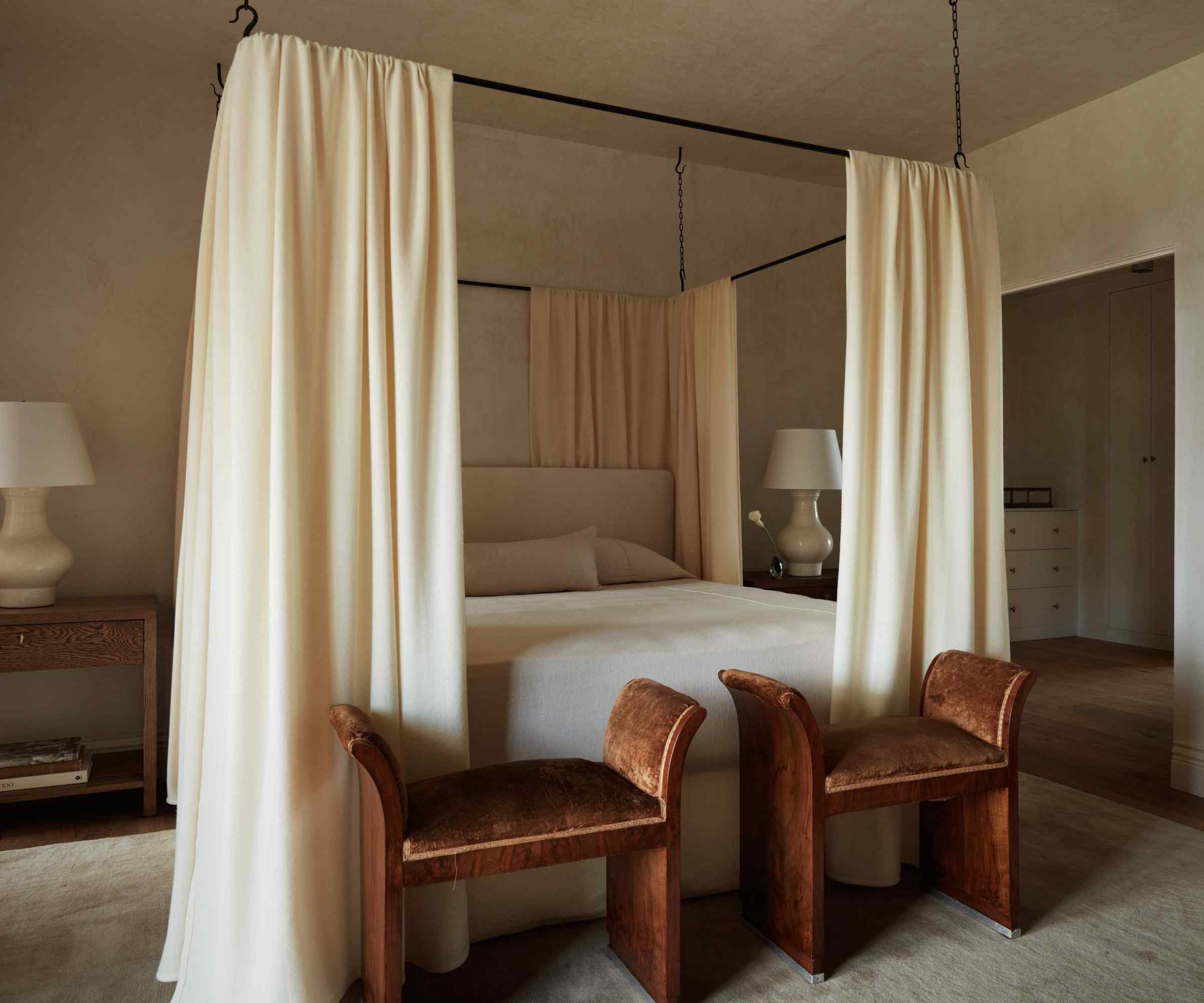
A Molly Kidd example uses creamy plaster, related-toned drapery, and an orderly furniture arrangement. The surface movement prevents a limited palette from reading as one flat color, while symmetry provides a quieter structure. Neither effect depends on adding many ornaments. Review the material under both daylight and the planned lamps; changes in texture are most useful when they remain perceptible in the conditions where the bedroom is normally occupied.
Read the warm neutral beside its red and wood accents
The warm-neutral example in Homes and Gardens uses Dimity alongside patterned upholstery, wood, and deeper red furniture. Its effect depends on those relationships as much as on the paint name. Compare a sample with the actual floor and largest fabric in the room before deciding it will act as a quiet background. A slight red undertone can support a warmer group but may look different beside a cool grey textile. This is a way to use the source's explanation, not a claim that one branded color is necessary. A locally appropriate alternative can serve the same design role when its undertone and behavior in the room have been checked.
Distinguish painted continuity from textured wall movement
Another room in the feature uses plaster to introduce variation within a close tonal family. Its depth comes from the surface as well as the color, while symmetry contributes a separate kind of order. A flat painted wall should therefore not be described as reproducing every property of the plastered example. Decide whether the bedroom needs a quieter background, a tactile surface, or a more balanced furniture arrangement before choosing a material. For an illustrative comparison, review the same bedding against a smooth sample and a textured one, then note how much additional pattern the group can comfortably support. The appropriate application and upkeep depend on the actual finish selected, not only its resemblance in a photograph.
Use one deeper element to keep a pale group legible
The source's white bedroom description relates crisp bedding to earthy accents that prevent the scheme from becoming uniformly light. A darker bedside piece, frame, or selected textile can give a pale room a readable point of emphasis without demanding a strong color throughout. Choose an element already useful in the layout, then see whether the contrast clarifies the bed and surrounding surfaces. These are possible adaptations rather than objects documented in every featured room. Additional accessories are not automatically necessary if the floor or existing headboard already supplies the depth. The aim is a balanced group of actual materials, not a fixed number of beige and white products or a guarantee that a pale palette creates the same mood for every occupant.
References
- 18 Bedroom Color Ideas Designers Return to Time and Time Again – From Soft Palettes to Statement Shades. Homes and Gardens; Charlotte Olby.
An earthy accent and tactile fabrics prevent pale bedroom colors from becoming a flat, disconnected backdrop.


Leave a Comment
Comments (0)