A Whole-Home Palette for Richer Color
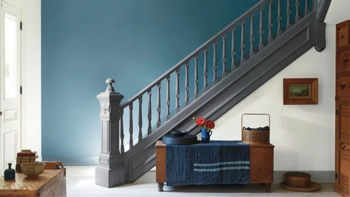
Benjamin Moore's maximalist Whole Home Palette uses Beau Green 2054-20 as its central shade. The family also includes rosy Sandblast, Hemlock, and berry-toned Mulberry. These colors suggest that a strong palette can have depth and variety without depending entirely on the brightest primary shades.
Supporting neutrals such as Intense White, Desert Shadow, and Abyss give the richer colors something to work against. Rather than assigning an unrelated statement color to every room, consider relationships across the home. A shared group of shades can guide textiles, paint, and smaller accents while still allowing individual rooms to have distinct identities.
Identify the anchor before distributing the stronger hues
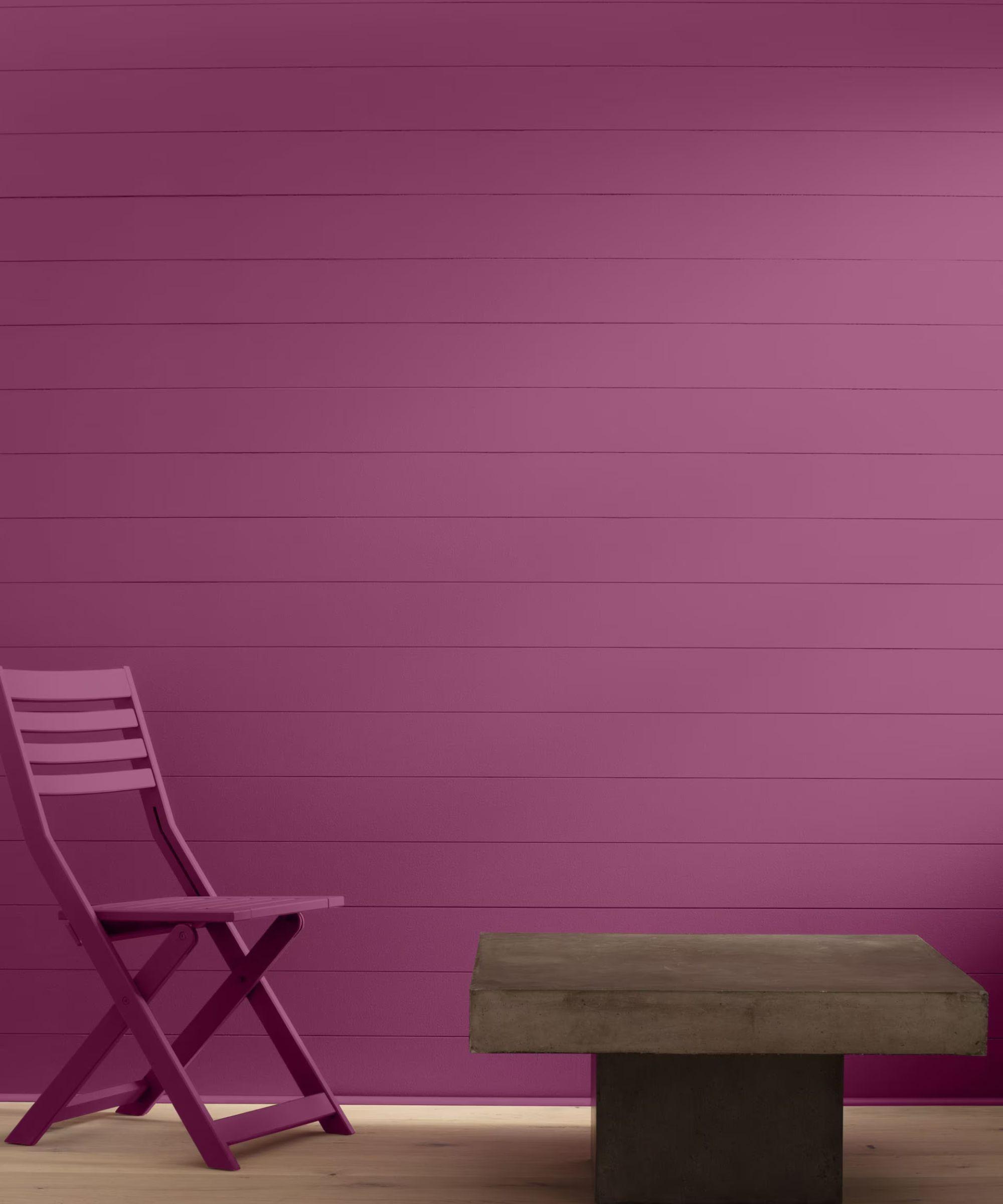
Benjamin Moore's palette centers on Beau Green 2054-20, a deep jewel tone described as combining emerald and sapphire qualities. It sits beside colors including rosy Sandblast, berry-toned Mulberry, lighter Hemlock, and supporting neutrals. Arianna Barone explains that the group is intended to give saturated colors enough depth to hold their own. That is different from using every available bright shade equally: the anchor gives the remaining choices a point of reference.
Adapt the family of colors to the scale of the project
The brand's examples allow a shade to move between a bedroom, cabinets, or accessories, so the palette can guide a limited update as well as several rooms. Select two or three relationships that suit the existing home, then test them alongside the actual floor and furniture. Colors coordinated on a palette card can still change under different light and finishes. The historical nod to the 1990s is the collection's design inspiration, not a requirement to reproduce that decade's furniture or introduce a complete maximalist scheme.
Give the anchor color a defined place in the home
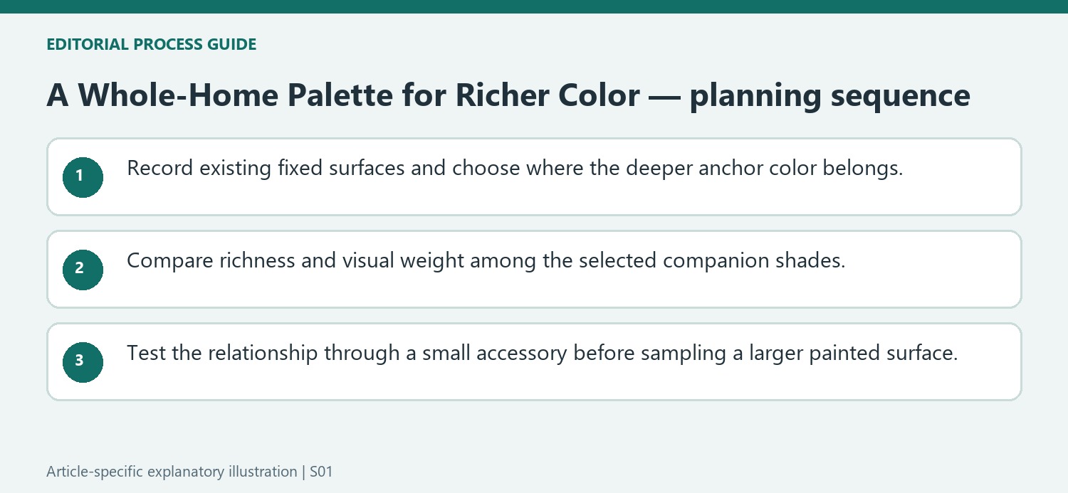
Benjamin Moore's palette uses Beau Green as its foundation, but Arianna Barone describes flexible applications rather than a requirement to paint every room green. Identify where a deeper jewel tone would have the clearest role: cabinetry, a bedroom wall, or a smaller furnishing each creates a different amount of color. Compare the adjoining views before selecting another shade from the family. A hallway may reveal two rooms at once, so their relationship matters even when each palette works alone. An illustrative whole-home plan records the existing fixed surfaces first and adds the new anchor where it supports them. This makes the collection a guide to decisions rather than a reason to replace every neutral surface with saturated paint.
Compare richness with brightness rather than confusing them
The source distinguishes the palette from a stereotypical collection of primary yellow and cherry red. Mulberry, Sandblast, Hemlock, Beau Green, and the darker supporting shades can create depth without all being equally vivid. Compare their visual weight through actual samples rather than choosing solely from a digital chart. One color can lead while a softer shade provides a pause. Barone also connects the palette with a contemporary interpretation of 1990s color, but historical reference does not dictate the furniture or accessories that must accompany it. Existing modern, traditional, or collected pieces can provide context. The useful question is whether the selected colors support each other's roles, not whether the room contains enough objects to qualify as maximalist.
Use accessories to test the relationship before a larger commitment
The article explicitly allows the palette to inspire decor as well as paint. A textile or vessel in a related hue can test how a deeper green or berry tone interacts with an existing neutral room. The object does not need to be an exact paint-color match to reveal whether the family is appealing. Review it beside the major surfaces and from the normal doorway view. If a larger project follows, choose a coating suitable for the actual substrate and sample the named paint separately; a fabric color cannot establish how a painted wall will behave. A small pair of colors can be enough to make the relationship visible, while the broader collection remains a set of optional supporting directions.
References
- Why Benjamin Moore's Maximalist 'Whole Home Palette' Is a Refreshingly Liveable Choice for Lovers of Color. Homes and Gardens; Eleanor Richardson.
Deep green, berry, and quieter supporting shades offer a coordinated approach to maximalist color.


Leave a Comment
Comments (0)