Mineral Colors Inspire a More Saturated Palette
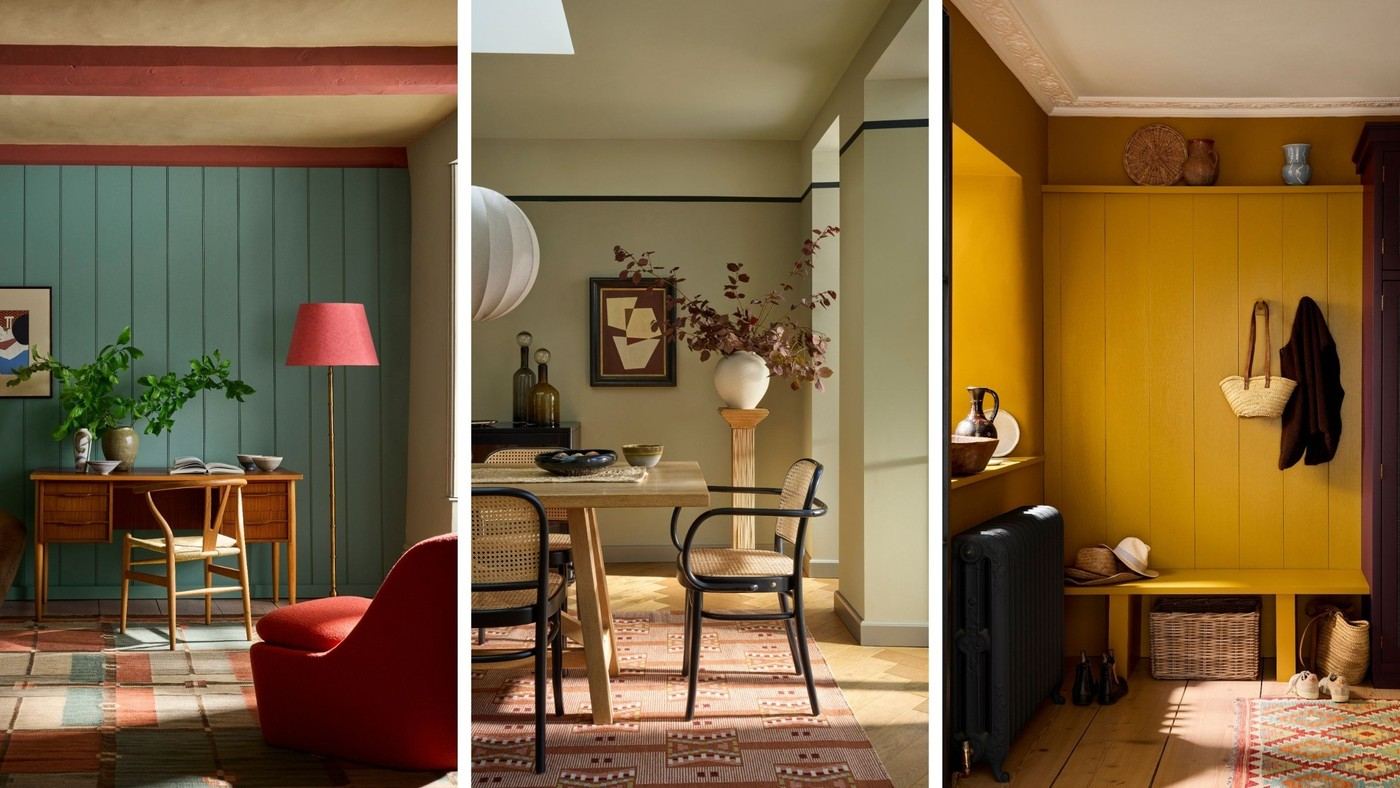
The Jewels collection from Paint & Paper Library takes inspiration from rare and semi-precious minerals. Its eight shades explore richer natural colors rather than assuming nature-inspired interiors must remain pale or green. The reference also considers their relationship to a neutral palette.
A saturated shade can appear across a larger area or become a more limited accent. Compare it with the existing materials before deciding. Confidence comes from a clear scheme and suitable proportions rather than simply applying the strongest color to every surface.
Link the names to their mineral inspiration
The collection's eight shades draw on natural mineral colors rather than a general neutral interpretation of nature. Peruvian Yellow refers to sulfur crystals, Midelt Sage to Moroccan epidote specimens, Blue Tiger to pentagonite from India, and Malachite to a rich emerald-green mineral appearance. These references explain why the palette includes strong saturated hues. The palette can therefore be nature-inspired without resembling a muted woodland scheme. These names are color inspirations, not a statement that the paints contain those minerals or share their physical properties.
Choose the amount of color before the paint finish
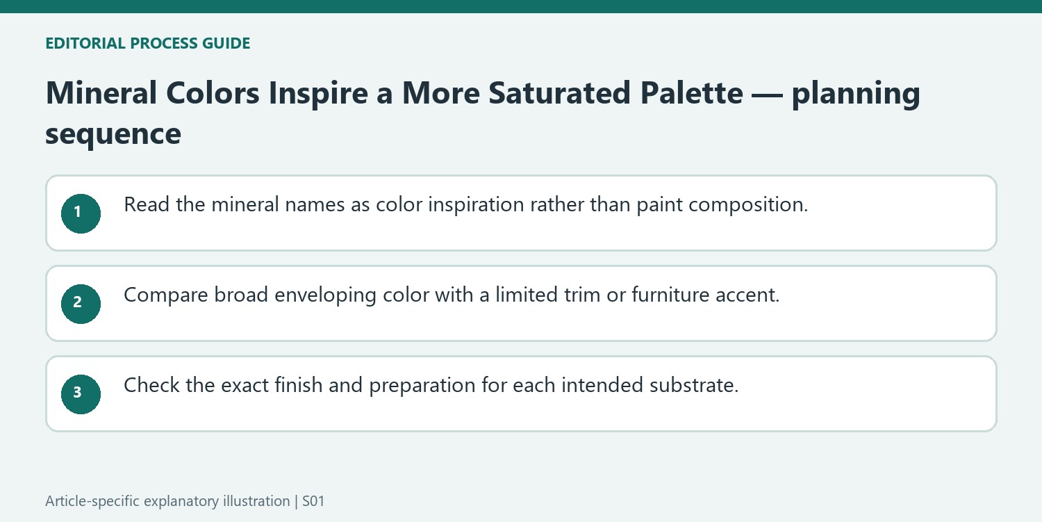
Andy Greenall describes both large expanses for confident schemes and smaller accents on trim, woodwork, or furniture. A compact room is another possible setting for a stronger color, provided the occupant wants that effect. Start by defining the surfaces that should change, then choose a coating suitable for each one. The article mentions multi-surface Architects' finishes, but the exact product instructions still govern preparation and use. Test the color with the room's neutral elements so the vivid addition has a clear supporting relationship.
Use the mineral references to understand the color range
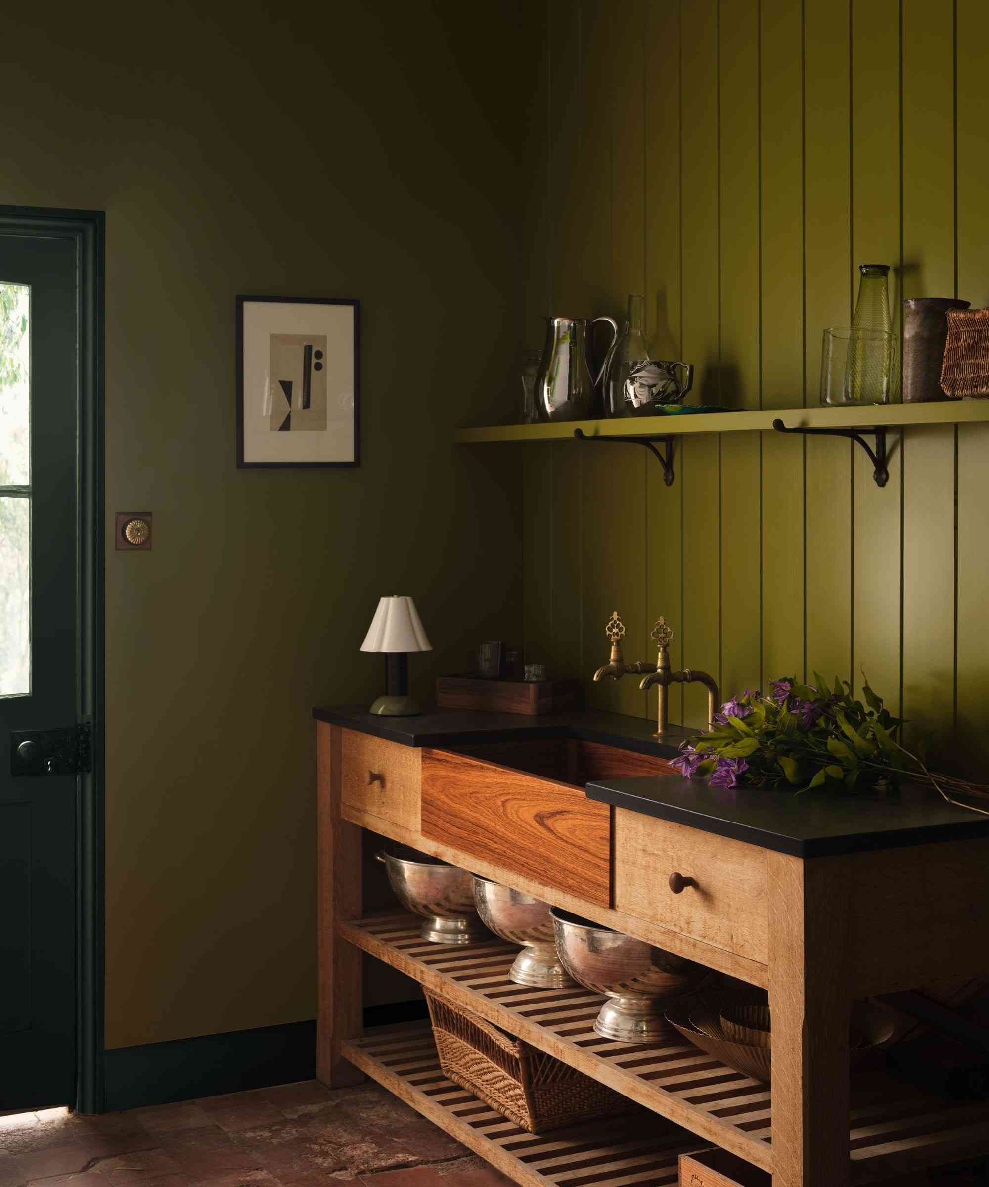
Paint and Paper Library's Jewels collection connects its shades with specific natural specimens rather than only familiar botanical colors. Peruvian Yellow refers to sulfur crystals; Midelt Sage draws on Moroccan epidote; Blue Tiger is linked with pentagonite from India. Malachite provides an emerald direction, while Atlas introduces a warmer orange-red associated with vanadinite. These references help explain the collection's variety. They describe color inspiration, not proof that a paint contains the named mineral or has the properties of a gemstone. Compare the actual paint sample instead of expecting a stone photograph to predict the finished wall. The distinction allows a natural reference to inform a scheme without turning the product name into a material specification.
Decide whether the color should envelop or punctuate
Andy Greenall proposes two quite different applications: broad expanses for a confident scheme, or selected woodwork, trim, and furniture in a quieter interior. Choose between them by considering how much of the shade will be visible from normal positions. An illustrative comparison might place a rich blue on a complete wall in one sketch and a single piece of joinery in another. Both use the same family but create different relationships with existing neutrals. A small room can also carry a strong color if the occupant likes the result; its size alone does not determine the correct level of saturation. The source offers possibilities rather than demonstrating that a particular bold color is suitable for every room orientation and existing finish.
Match the product finish to the selected surface
The feature mentions the Architects' range as a way to achieve consistent color across several substrates. That does not remove the need to check the exact product's approved uses, preparation, and application instructions. A room may include previously painted timber, plaster, and other surfaces with different requirements. Confirm those details before treating a continuous visual scheme as one simple coating task. Rose Cluster offers a softer alternative within the collection if a fully saturated room feels too forceful, while Cobalto and Purple Azurite provide different depths to compare. There is no need to incorporate all eight colors. A selected pair, supported by appropriate materials and a well-tested finish, can convey the mineral-inspired idea more clearly than a collection of unrelated bright accents.
References
- Explore Paint & Paper Library’s brand new ‘Jewels’ color collection – 8 joy-giving shades inspired by the vibrancy of natural minerals. Homes and Gardens; Emily Moorman.
Paint & Paper Library's Jewels collection uses nature beyond familiar greens.


Leave a Comment
Comments (0)