Warm Interior Colors Can Go Deeper Than Beige
Look for warmth within a more complex shade
The reference argues that warmth does not require covering a room in beige. Designers are also using deeper, muted colors with more visible character. Cola brown is one example: its red undertones can create an enveloping effect in a small bedroom. The shade still functions as a versatile background, but it brings a different depth from a pale neutral used across every surface.
Build the supporting palette around the undertone
In the featured interior, rich green, natural wood, patterned brown drapery, and a terracotta detail sit alongside a dark wall color. Their relationship provides interest without making every element equally strong. When considering a warmer alternative to beige, assess the nearby timber and fabrics as well as the paint. A nuanced scheme comes from those supporting connections, allowing a deeper color to feel intentional rather than simply darker.
Use undertones to distinguish the alternatives
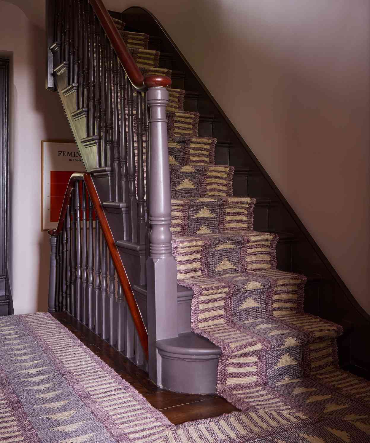
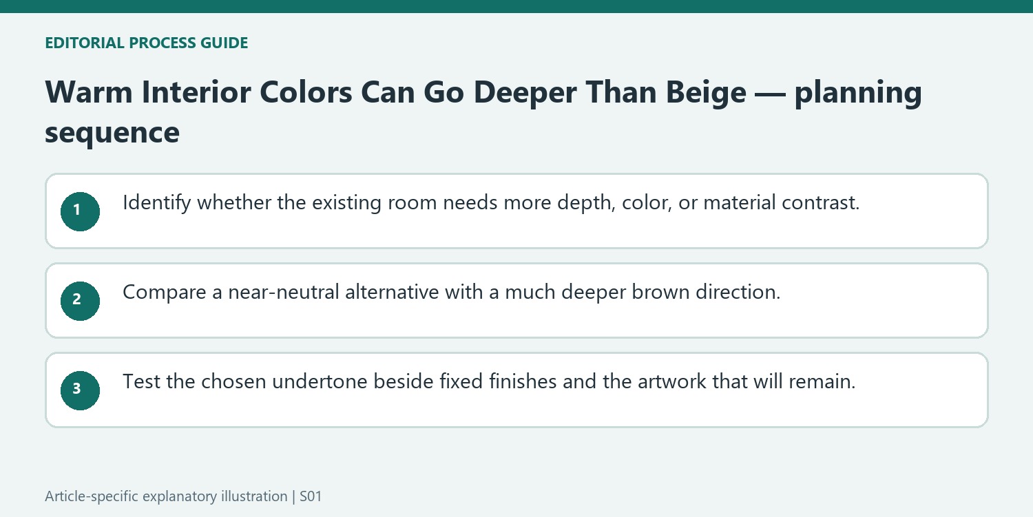
The reference compares cola brown, soft mauve, and buttery yellow as more nuanced routes to warmth than a uniform beige scheme. Amy Knerr describes reddish depth in brown, while Anna Haines uses mauve as a relatively quiet background for a stronger art collection. Their examples show that a color can remain restrained while containing more visible undertone and variation. Test the alternatives beside the actual wood and textiles before choosing a full-room application.
Give rich color quieter material companions
The designers pair deeper brown with oak, bronze, marble, and substantial linen, and connect mauve with painted timber and dusky related shades. Those materials support the palette without needing identical colors. View samples during the day and after dark, because perceived depth changes with light. The article's criticism of beige is a stylistic preference, not a reason to remove a neutral scheme that already works. Consider a targeted accent or material change before assuming every wall needs a new color.
Choose the degree of change from an existing beige foundation
The feature's five alternatives are not equally distant from beige. A muddy pink or soft mauve can retain a comparatively quiet background, while a cola brown creates a much deeper enclosure. Compare the intended effect before choosing a paint name. In Anna Haines' entrance example, mauve supports bolder artwork and darker woodwork rather than competing with them. In Of Place Studio's darker rooms, timber, marble, bronze, and patterned fabric help explain the brown's richness. These are different arrangements, not interchangeable swatches. An illustrative first step is to identify whether the existing room lacks depth, color variation, or material contrast. That diagnosis may reveal that an accent or furnishing change would be enough without replacing all the beige.
Read the yellow example as a complete material composition
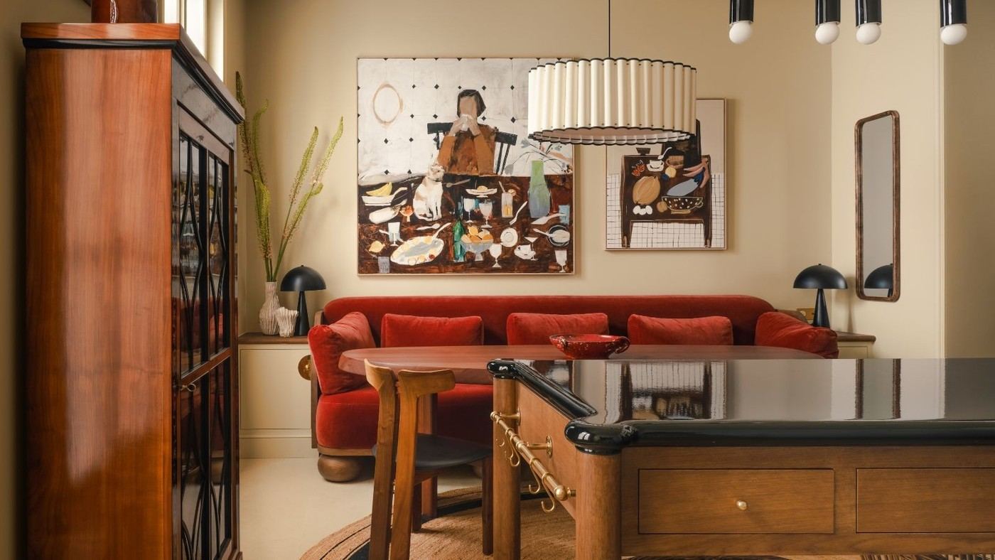
Jessica Helgerson's Paris project combines a yellow ceiling, related counter and backsplash surfaces, a rich red sofa, and a quieter grey-toned cabinet color. The warmth comes from the interaction of these elements, not from one isolated yellow sample. Another room may already contain warm wood or a strong textile, so the same amount of yellow could be unnecessary. Compare the proposed color beside the fixed surfaces and decide which should remain quieter. The source's explanation of using two related cabinet tones also shows how color can distinguish existing forms without rebuilding them. This is a design possibility to assess in the actual room rather than a guarantee that butter yellow will improve every cool or north-facing interior.
Treat a muted green or pink as a tested background
The source's greens, soft mauves, and muddy pinks are described as nuanced because they can sit between more familiar color categories. Their behavior depends on their undertones and neighbors. Test the sample with natural timber, metal finishes, and the artwork that will remain visible. Examine it at more than one time of day before committing to the whole surface. A subdued color may act as a background in one scheme and a noticeable accent in another. The article's dismissive framing of beige does not make an existing beige room a mistake. Use the alternatives as a way to make a deliberate comparison, keeping the palette that remains pleasing and useful to the occupant rather than selecting a replacement solely to follow a trend.
References
- Sorry, Beige Really Is Boring – 5 Colors Designers Are Replacing It With for More Exciting Warm Interiors in 2026. Homes and Gardens; Charlotte Luxford.
Muted brown, natural timber, and grounded accents offer a richer alternative to an all-beige room.


Leave a Comment
Comments (0)