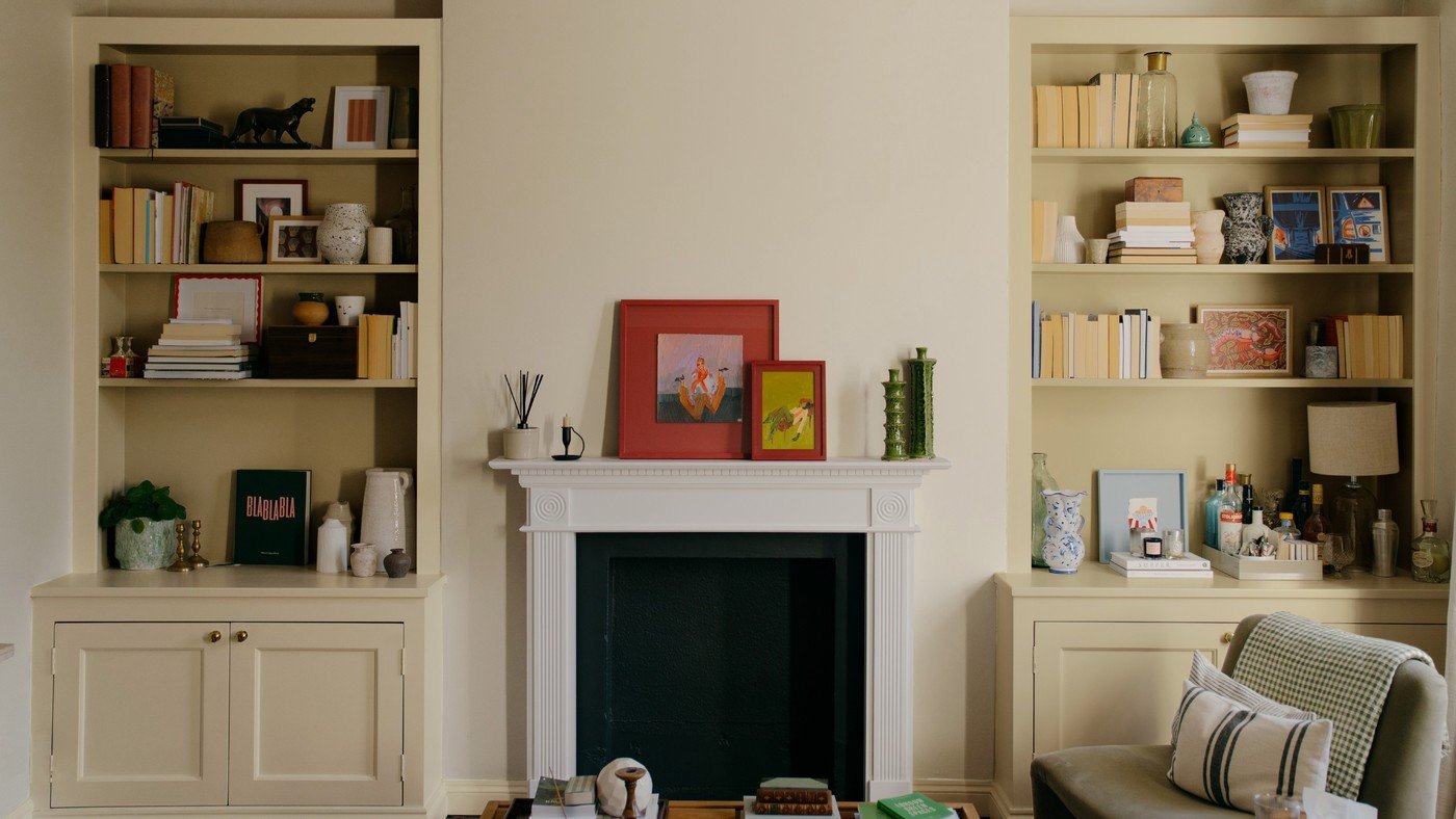
Assess Paint Color in the Light Where It Will Be Used
The COAT release discussed in this reference introduces 33 shades developed with UK light in mind. That focus highlights an important part of paint selection: a color chosen elsewhere may behave differently under local daylight and the room's own orientation.
A brand's intended setting does not remove the need for testing. Compare samples through the day and under artificial light alongside neighboring finishes. Choose a shade for the actual home rather than assuming a collection label guarantees that no room will feel dark or cool.
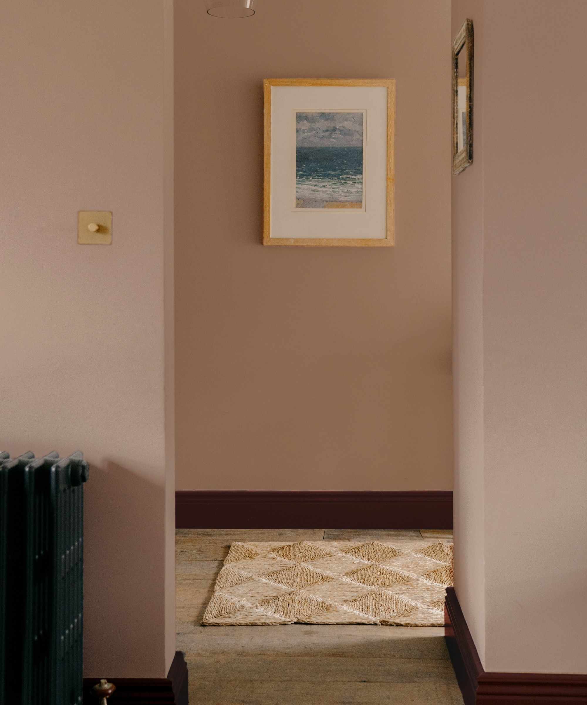
Understand the distinction between new and returning shades
The article reports a thirty-three-color release but clarifies that nineteen shades are new and fourteen return from earlier collaborations or limited editions. This matters when describing the range accurately: the launch expands the permanent selection rather than inventing every color from scratch. It includes additional yellows, greens, and browns, with some hues previously associated with House Nine Design. Named examples include the green Retrograde and the warmer yellows Cheap Souffle and Gwen, illustrating the range within those families.
Use the lighting claim as a reason to sample carefully
Rob Abrahams describes muted, desaturated colors developed for the cool, diffuse light common in UK homes. The yellows are intended to avoid an overly bright, pastel, or cold appearance, and some use warmer ochre undertones. That is the brand's design aim, not a guarantee that every shade suits every north-facing room. Test samples at different times beside existing finishes and under the evening lamps. A color developed for a broad lighting condition can still change substantially with window size, neighboring buildings, flooring, and the selected coating finish.
Read the launch numbers accurately
The Ideal Home report describes thirty-three additions to COAT's core offering, but distinguishes nineteen newly developed colors from fourteen returning shades. Nine of the returning colors are connected with the House Nine collaboration. That detail matters when comparing the release with an existing sample or earlier product: a familiar name may have been reintroduced rather than newly invented. The yellow expansion includes five shades, alongside additional greens and browns. The article's account of early favorites reflects the launch period, not a verified forecast of what every household will choose. Use the range as a set of options and check the current listing for the exact shade, finish, and availability before assuming a product remains unchanged. Keep an earlier sample label when comparing an existing wall with a reintroduced shade, and verify the exact product rather than inferring compatibility from the shared name alone.
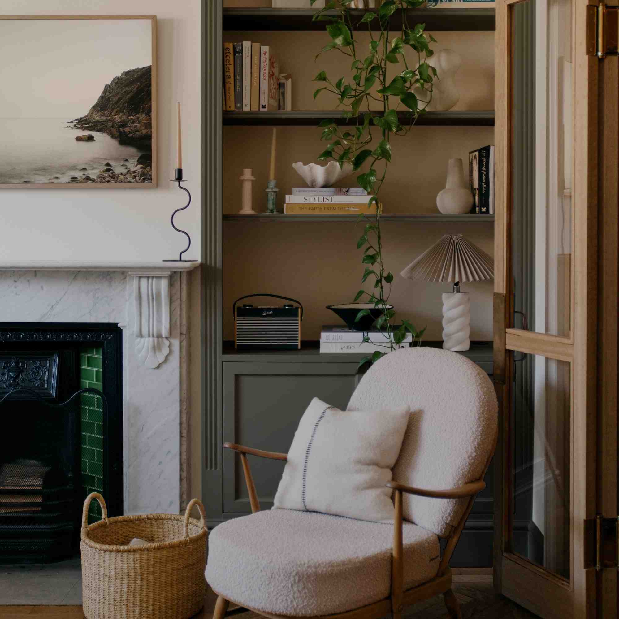
Translate the UK-lighting claim into a room-specific sample check
Rob Abrahams explains the design intention in terms of cool, diffused daylight, north-facing rooms, and lower winter sun. Muted and desaturated tones are intended to remain usable under those conditions. This is the brand's rationale, not proof that every room in the UK has identical light or that the colors cannot work elsewhere. Place an actual sample beside the room's existing floor, furniture, and textiles, then revisit it at different times. A daylight photograph cannot show the evening result under the household's lamps. Record which sample remains appealing in the conditions that matter most, rather than relying on the launch headline's promise that no room will feel cold or dark.
Compare the yellow's undertone rather than the trend label
The source contrasts problematic bright, pastel, or cold yellows with deeper, ochre-influenced options such as Cheap Souffle and Gwen. Their names and the butter-yellow label provide an introduction, but the useful comparison is the actual warmth, depth, and relationship with nearby surfaces. A yellow may be selected as a small furnishing color or a larger painted area; those applications should be sampled separately. Likewise, a green accessory that resembles Retrograde cannot establish an exact paint match. Current coating instructions still control preparation, substrate suitability, and application. The range offers a starting palette for real-room testing, with the final decision based on the specific space rather than the assumption that a nationally targeted collection removes the need to sample.
References
COAT's expanded range places emphasis on UK interiors.


Leave a Comment
Comments (0)