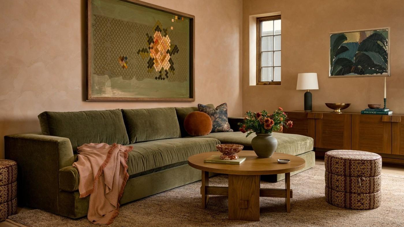
A Living Room Needs a Texture Scheme as Well as Color
Mix fabrics with different surface qualities
The designers in the reference recommend giving texture the same attention as color. A tight weave beside velvet or boucle creates depth, while a knitted throw changes the character of a sofa. Wood, leather, and warmer metal finishes contribute additional contrasts. These combinations are especially useful in a neutral room, where a closely related palette can otherwise make separate furnishings blend into one flat background.
Extend the layers to the floor and walls
Texture is not limited to adding a soft blanket. A vintage patterned rug over natural jute creates a more layered floor, while grasscloth, silk, or linen wallcoverings change the larger surfaces of the room. Consider the interplay of smoother and rougher finishes across the whole setting. The aim is a connected interior in which materials create depth and comfort without every item competing through a different color.
Choose the texture scheme for the room's use
Louise McGarry distinguishes a relaxed combination of linen, aged leather, matte timber, and natural fibers from a more formal mix using silk, velvet, glass, or glossier finishes. These are different starting points rather than a checklist to combine indiscriminately. Decide how the room is used in daylight and evening, then choose contrasts that support that atmosphere and can withstand the household's normal use.
Let one surface lead the material change
The article discusses a velvet sofa with cotton cushions and wooden furniture, layered rugs, grasscloth, and limewash as several ways to introduce depth. A wall treatment affects a much larger area than a throw, so assess scale before selecting the intervention. Begin where the room currently reads as most uniform and compare smooth with woven, matte with reflective, or soft with solid. A coherent contrast is more useful than simply increasing the number of textures until every surface feels equally busy.
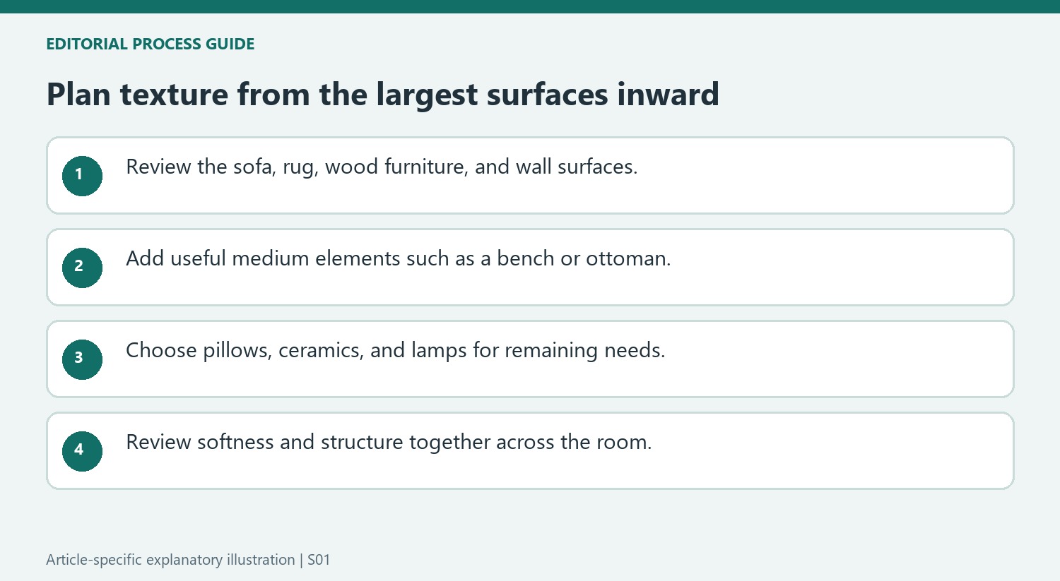
Begin the texture plan with the largest surfaces
The designers in the source recommend considering the rug, sofa, upholstered chairs, substantial wood pieces, and other foundational surfaces before choosing smaller accessories. That sequence prevents a room's texture from depending entirely on a collection of cushions. Identify what is already soft, smooth, structured, or visibly woven, then decide which quality is missing. A large material choice affects the balance differently from a small ceramic object. The same principle works within a restrained palette: surfaces can differ meaningfully without introducing another strong color. A room that feels flat may need a better relationship between those broad areas rather than simply a larger number of decorative objects scattered across them.
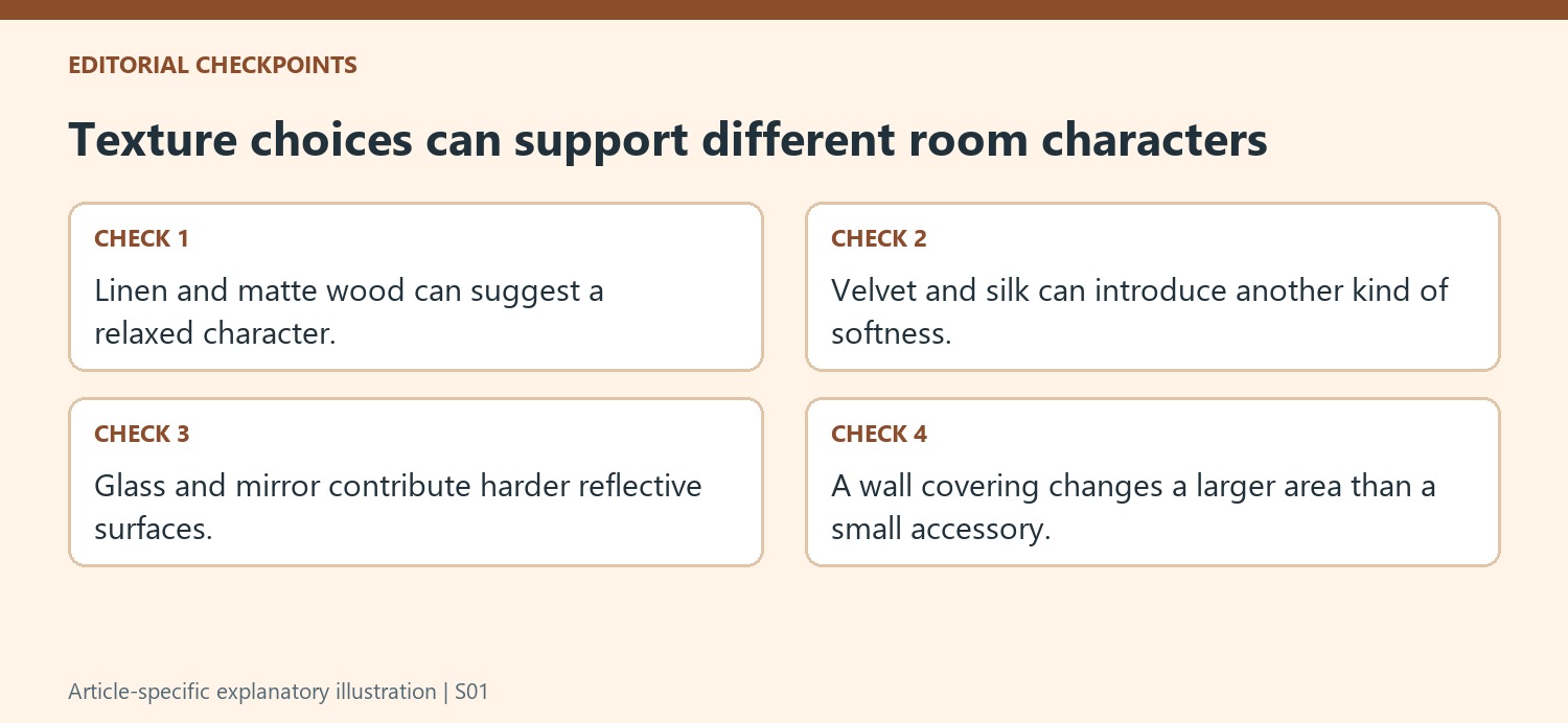
Match the material character to the room's intended use
The source contrasts relaxed organic finishes with richer, more polished materials associated with formal or evening spaces. Heavy linen, worn leather, matte wood, and natural fiber can create one language, while silk, velvet, mirror, and gloss create another. These are design directions rather than strict categories that cannot be combined. Decide what atmosphere the room needs and select the contrasts that support it. A smooth surface can provide relief beside a very tactile one, and a tightly woven textile can define a different note from a deeper pile. The aim is a considered mixture, with each material contributing a recognizable role rather than several near-identical textures repeating the same effect.
Add medium and small layers where they make a difference
Once the main surfaces work together, the article's designers move to benches, throws, pillows, lamps, ceramics, and greenery. Those finishing layers can connect larger choices or introduce a missing texture at a manageable scale. Review the room as a whole before adding another item to the same corner. Wall treatments are another opportunity, with the source discussing textile coverings and softer painted effects rather than limiting texture to fabric draped over furniture. Its enthusiastic call for layering should not be read as a requirement to fill every surface. A useful test is whether an addition improves the balance of softness, structure, and material character while leaving the room practical and comfortable for its actual daily use.
References
Smooth stone, woven rugs, and richer upholstery can connect a restrained room through material contrast.


Leave a Comment
Comments (0)