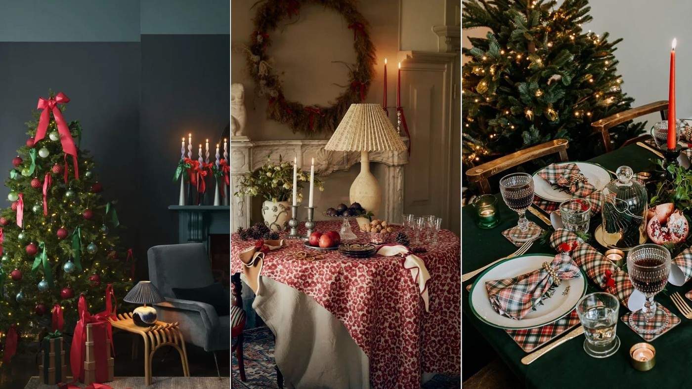
Red and Green Connect Christmas Color to Winter Nature
The Christmas color reference traces red and green through several historical and symbolic associations. Holly berries and evergreen foliage provide familiar natural examples. Designers also connect the combination with older winter celebrations, Christian symbolism, and later festive imagery.
Using the colors effectively does not require equal amounts of bright red and green. Layered forest tones can create a quieter foundation, with red appearing in selected accents. The relationship between shade, proportion, and the existing interior determines whether the traditional palette feels balanced in a particular home.
Treat the history as several overlapping associations
The reference discusses evergreen leaves, red berries, religious symbolism, and later Christmas imagery as influences on the familiar combination. The article connects those associations with contemporary choices in foliage, ribbons, and table settings. Those explanations are presented through designer commentary, so it is more accurate to describe multiple associations than claim a single proven origin. The same palette can feel quite different depending on whether the display emphasizes natural greenery, nostalgic ornaments, or saturated painted surfaces.
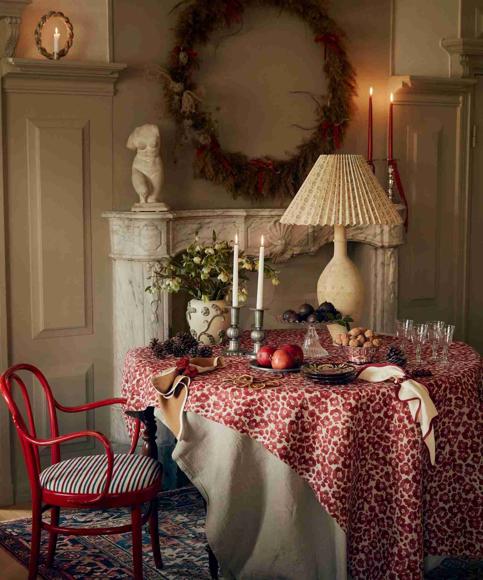
Change the proportions before changing the whole palette
Helen Shaw suggests layering forest greens and introducing red in smaller accents, while Patrick Fox favors darker burgundy and green with cream, charcoal, or metallic finishes. A ribbon, candle, or table linen can provide the red while foliage supplies most of the green. The source also allows a brighter vintage direction, with patterned crackers and nostalgic glassware. Decide which atmosphere suits the household, then repeat a few chosen tones. The aim is a coherent relationship between materials and colors rather than an obligation to make every decoration a matching pair.
Choose a mood before selecting individual decorations
The source presents a quieter forest-and-burgundy direction and a brighter nostalgic table as equally possible interpretations. Decide which suits the household's existing room and celebration. That decision helps determine whether the color should come mainly from foliage, textiles, vintage glass or more saturated ornaments, instead of combining every version at once.
A quieter palette may use more green than red, with a ribbon or a small group of candles acting as the accent. A nostalgic arrangement may repeat brighter shades across several patterns. Compare the intended result with the room's permanent upholstery, walls and woodwork. Those surfaces remain part of the composition even when the holiday details are strongly themed.
Use materials and proportion to make familiar colors specific
Natural greenery provides variation within the green itself, while linen, glass and metal give the red different surface qualities. This is why two displays using the same color names can feel quite different. Look at the actual amount and finish of each material rather than expecting an equal pair of colors to create balance automatically.
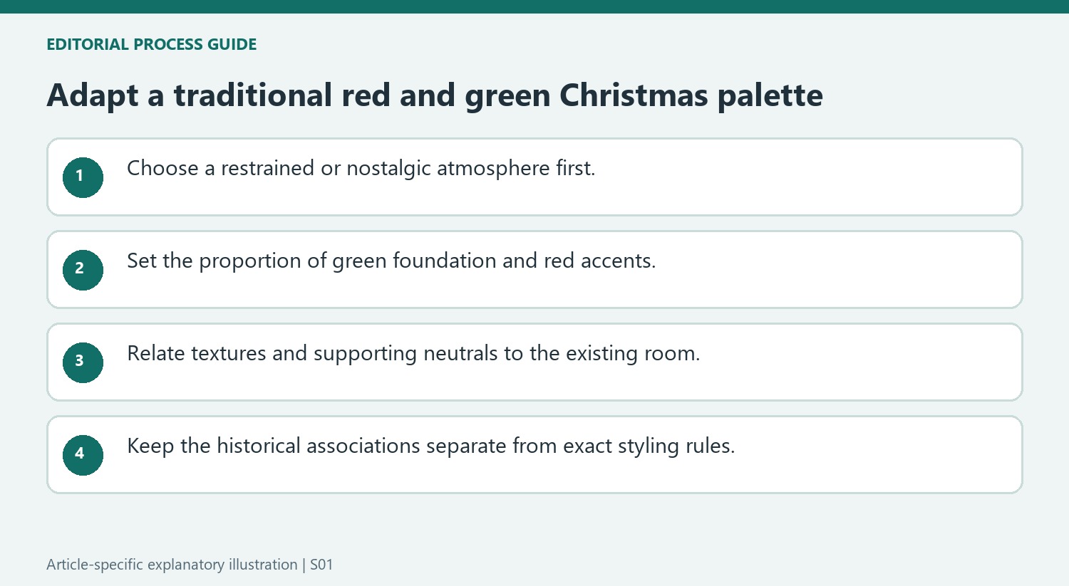
The article also suggests cream, charcoal and metallic details as supporting elements for darker versions of the palette. These can provide quieter areas between stronger accents. Begin with what is already owned and identify a limited number of repetitions, keeping the display connected without making every object a red-and-green pair. A consistent proportion can be more useful than purchasing an entirely matching set.
Keep the historical explanation separate from the styling choice
The designers connect the colors with winter greenery, berries, religious symbolism and later imagery. These overlapping associations help explain their familiarity, while the source does not establish one exclusive origin through a primary historical investigation. Preserve that distinction when describing why the combination remains recognizable today.
A home does not need to reproduce every historical reference to use the colors successfully. Choose the shades and materials for the actual room, then check the practical placement of wreaths, garlands and tabletop objects. Seasonal greenery and textiles still need to remain clear of unsuitable heat sources. The lasting lesson of the feature is flexibility within a familiar palette: proportions, textures and surrounding neutrals can change while the festive association remains easy to recognize.
References
- Why do we decorate with red and green at Christmas? Designers weigh in on this coveted color combination that's seeped in tradition. Homes and Gardens; Emily Moorman.
Berries and evergreen leaves help explain the enduring appeal of the traditional pairing.


Leave a Comment
Comments (0)