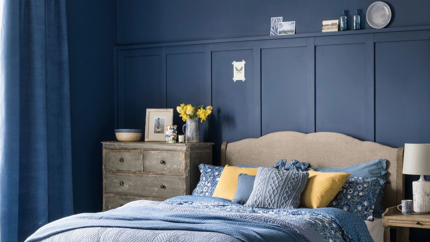
A Continuous Paint Scheme Changes Bedroom Boundaries
Color drenching extends one chosen hue through a bedroom rather than using several contrasting painted zones. The reference contrasts it with feature walls and two-tone schemes. The resulting continuity can emphasize a more enveloping appearance, especially when walls and adjacent details relate closely.
Consider how the furniture and fabric will provide variation once the painted boundaries become quieter. The technique does not guarantee better sleep or a higher property value. Choose it because the room's light, architecture, and preferred atmosphere support that particular visual effect.
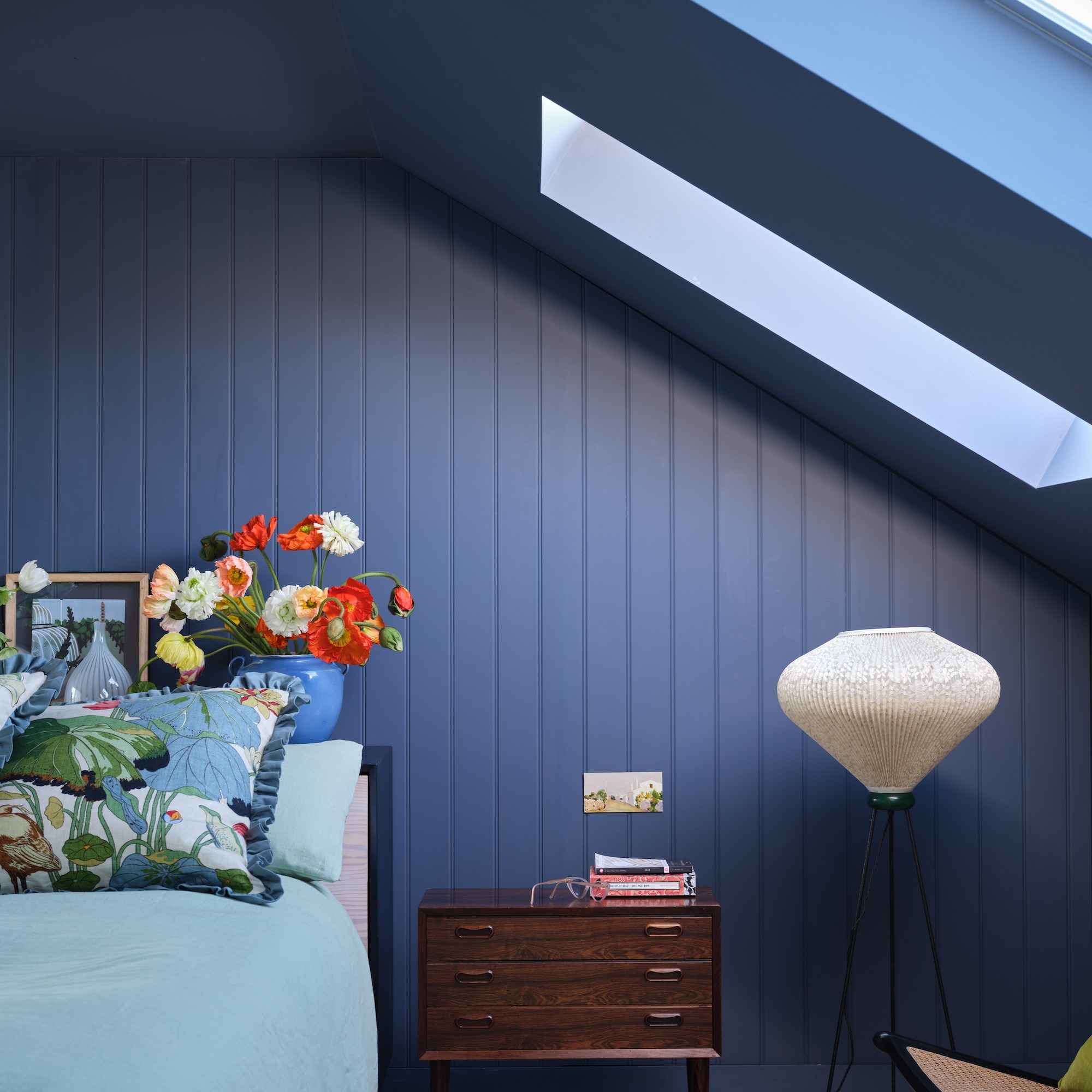
Evaluate continuity around awkward architecture
The source defines color drenching as extending one shade across walls, ceilings, and woodwork, potentially including suitable radiators. An attic example uses a continuous dark blue around slopes and skylight recesses, reducing the abrupt contrast that would otherwise outline each angle. This changes the perception of the boundaries; it does not physically enlarge the room. Examine the ceiling shape and trim first, then identify where a bright contrasting edge is currently drawing unwanted attention.
Retain detail through texture and the correct finish
Paneling can remain visible in a drenched room because its relief catches the light even when its color matches the wall. The article also describes a dusky lilac scheme and a pale green option, showing that the technique is not confined to dark paint. Test the selected hue at different times and use coatings suited to each substrate. A wall emulsion is not automatically appropriate for woodwork or heated metal. Treat the source's relaxation language as aesthetic opinion rather than proof that a paint technique treats insomnia or guarantees better sleep.
Define what the continuous treatment will actually include
Ideal Home describes color drenching across walls, ceiling, woodwork, and sometimes radiators, but those surfaces can require different paint products and preparation. The common color is a visual decision, not permission to use one coating indiscriminately. List the elements intended to recede and any fittings that should remain distinct, then assess how the existing furniture will read against the broader area of color. An illustrative sketch can reveal whether the scheme removes a distracting break or hides an architectural detail worth retaining. The published bedrooms demonstrate alternatives within the technique, rather than establishing that every surface must be covered for the room to qualify or that every feature is suitable to paint.
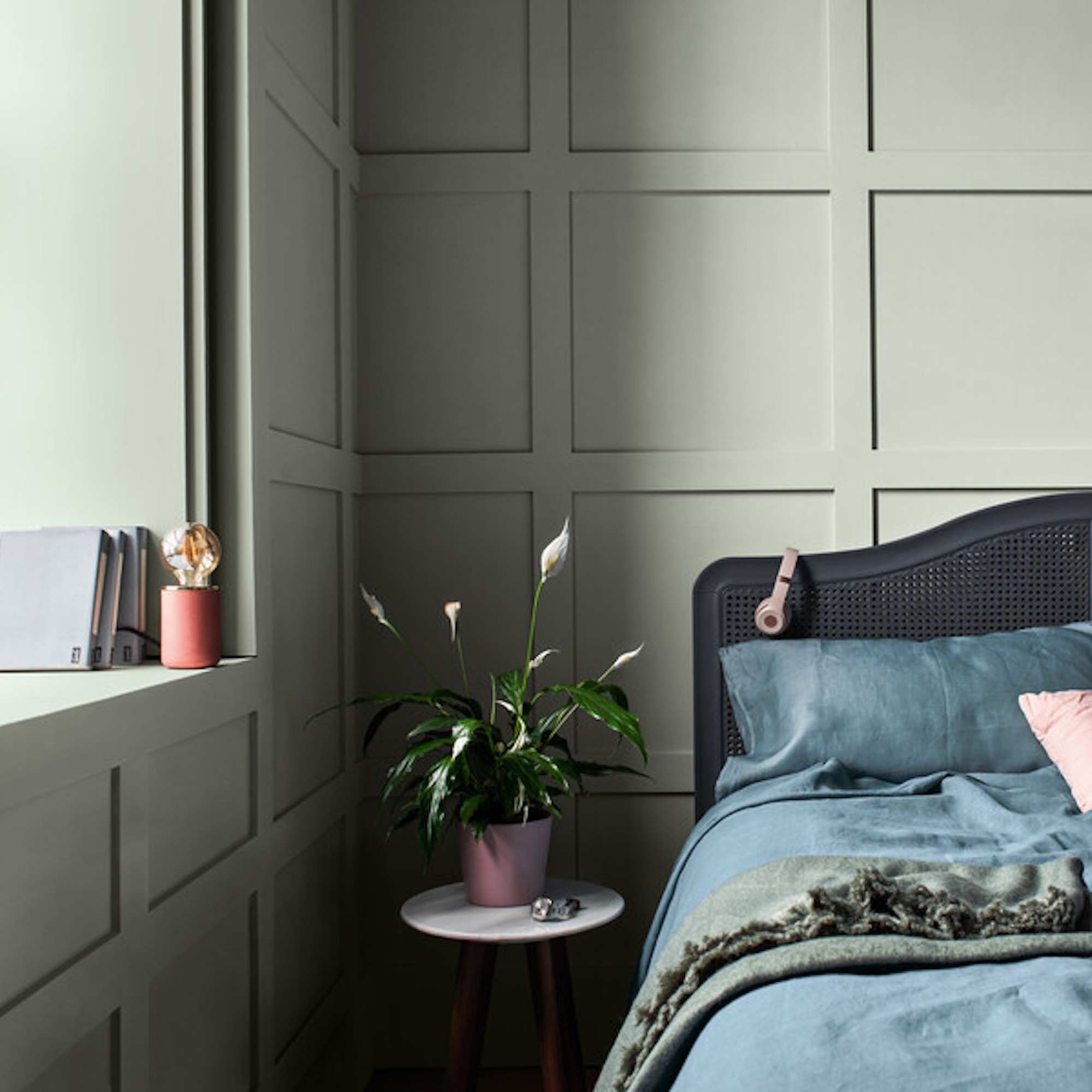
Use continuity to assess an awkward ceiling line
The feature's loft example carries one dark color across sloping walls, ceiling, and recesses. That reduces the visual contrast at their junctions, changing how the angles are perceived. It does not enlarge the loft or increase headroom. Compare the intended effect from the bed and entrance, where a low slope may be most noticeable. A partial approach may leave a break that serves a useful purpose, while a complete wash may feel more enclosing. Try the actual color with the room's available light before choosing based on a professionally exposed photograph. The practical issue is which boundaries should become quieter, not whether a darker or lighter scheme is inherently correct for every small room. Paneling can still contribute shadows and texture when it shares the wall color, as the source illustrates, so continuity does not have to erase every detail. Compare that quieter relief with the stronger outline the same trim would create in a contrasting shade.
Evaluate comfort without borrowing unsupported health claims
The source includes strong language linking colors with calm and sleep. Such descriptions can explain a designer's intention, but they do not show that color drenching treats insomnia or produces a physiological response in every person. Choose a scheme the occupant finds pleasant and assess it alongside useful lighting, bedding, and layout. The article's muted green and dusky examples can be compared as design options rather than therapeutic prescriptions. A continuous color may simplify palette decisions, yet the actual finish, preparation, and amount of painted surface still affect the project. The best comparison is with the room's present visual interruptions and the occupant's preferences, not a promise that one technique guarantees a restful night.
References
- Is colour drenching a bedroom a good idea? 7 rooms that prove it is. Ideal Home; Linda Clayton.
Color drenching connects surfaces that usually appear as separate planes.


Leave a Comment
Comments (0)